A $2.10 part was holding up $43,655 in customer shipments. The product's largest customer was buying below cost. Two warehouses on opposite coasts were fulfilling each other's backyards. None of that showed up on a standard report, and all of it came out of one of my NetSuite test accounts in a few minutes each.
This post walks through nine prompts in the Sonar AI Prompt Library that cover the physical side of the business: bills of materials and shortages, supplier risk, purchasing and margin, and where the inventory sits. They were added across the August releases, and I've grouped them by the question they answer.
If you're new to this, Sonar AI is an AI agent that runs inside NetSuite. Every prompt in the library is a playbook that I engineered and tested against live NetSuite data, and you run it inside your own account, against your own records.
Bills of Materials and Shortages
Where does a product's cost actually live? For one flagship assembly in the test account, the answer wasn't any part on the bill of materials. It was the 62.5 percent of unit cost sitting in assembly labor and overhead, and one frame operation quietly drifting ten percent above standard.
The BOM Cost Sunburst renders a multi-level bill of materials as a zoomable sunburst. Concentric rings are BOM levels, wedge size is cost contribution, and color is drift since the standards were set. You can drill into any subassembly and toggle between full cost and material only. Around the chart are a margin bridge against realized selling prices from actual invoices, and the drift annualized against real volume, which is the number that funds the fix.
Because it checks realized prices per customer, the sample run surfaced something nobody was looking for. The product's largest customer had bought 897 of the 976 units sold in six months at an average $8.64 below the $166.59 unit cost. The blended 6.9 percent margin was being carried entirely by list-price buyers. A cost analysis found a pricing problem, and the report says so before it says anything about cost wedges.
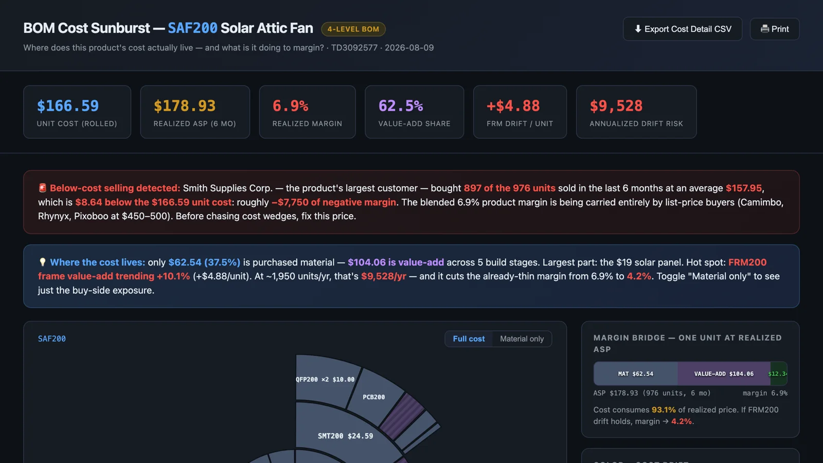
Sample report: BOM Cost Sunburst: SAF200 Solar Attic Fan.
The Component Shortage Dependency Graph starts from the other end. Your shortage report shows you the biggest shortage. In the test account, that was a $124K stock-replenishment item blocking exactly zero dollars of customer orders. The prompt builds a network graph instead: shortages, then the work orders they block, then the sales orders and dollars behind those, then the customers waiting. Chokepoints are ranked by leverage rather than size, joint blockers are grouped so you know when three parts have to be bought together or nothing unlocks, and stock builds are separated from customer-blocking shortages.
In the sample run, $14,580 of parts was gating $151,199 of customer orders, a 10.4 times buy-back. The single biggest lever was a $2.10 piece of Kapton plastic, the sole blocker on 13 work orders feeding $43,655 of sales orders for four customers. Buying the missing 1,442 units cost $3,028. The graph makes that asymmetry visible in a way a flat report can't: small red dots on one side, six figures of waiting customers on the other.
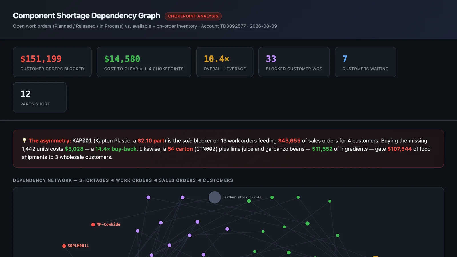
Sample report: Component Shortage Dependency Graph.
Supplier Risk
How concentrated is our supplier risk, in dollars? Most finance and operations leaders can't answer that today. The Supply Chain Risk Exposure Review quantifies it from live purchase order and vendor bill data: top-N supplier shares and the HHI concentration index, single-source items and the spend flowing through them, geographic concentration, disruption scenarios with expected-loss math, and a costed mitigation plan that includes what isn't worth fixing.
The test account's profile was unusual. International exposure was negligible, but five suppliers carried 87 percent of direct spend, and the four largest clustered in the San Francisco Bay Area. Sixty-five percent of spend shipped from one seismically active metro. The report's phrase for it: diversified on paper, correlated in practice. It also reconciles PO spend against vendor bills as an integrity test, and that turned up a supplier billing 2.75 times its PO volume, which standard controls wouldn't see.
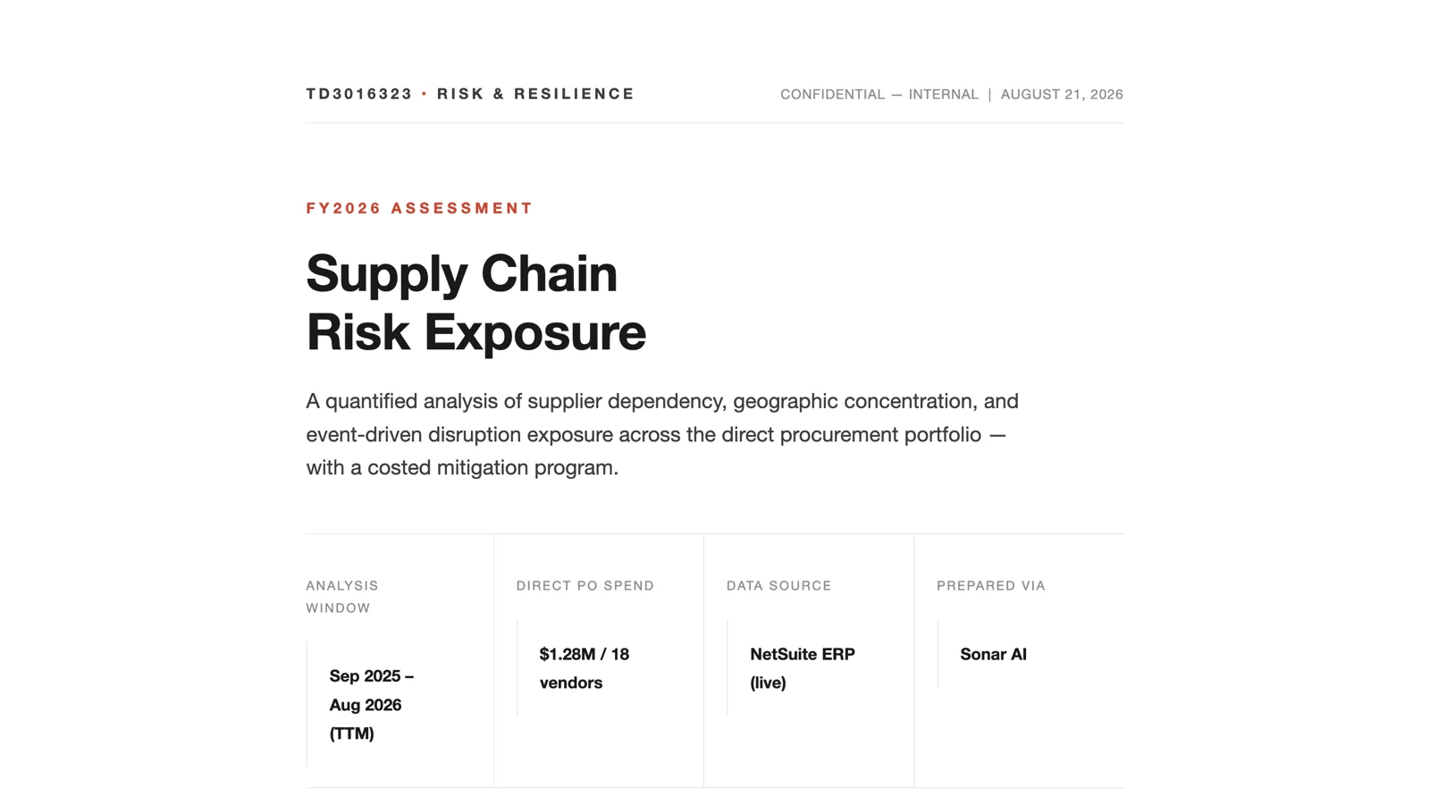
Sample report: Supply Chain Risk Exposure: FY2026 Assessment.
The Supply Promise Anchor Audit looks at a quieter risk: the delivery dates on your purchase orders. It grades every vendor's promise against actual receipt history, with signed variance, dispersion, and lateness at the 90th percentile, and then quantifies how much committed customer demand is anchored to unreliable dates. In the test account, the dominant problem wasn't vendor performance at all. Four vendors showed lateness climbing in exact seven-day steps because their PO lines carried a frozen expected date that nobody had updated. The largest vendor by received value, 41 percent of the total, had no promise dates on any line and was therefore invisible to the scorecard. The report's point is that a vendor who is reliably ten days late is a solvable problem, and a vendor whose variance swings twenty days either way isn't, because every downstream commitment inherits the swing.
Sample report: Supply Promise Anchor Audit.
Related to that is the Supply Allocation Logic Evaluation, which answers a question that's harder than it sounds: what allocation logic is our NetSuite account actually using? NetSuite layers several generations of commitment logic, and the UI, the feature flags, and the runtime behavior can each tell a different story. The prompt probes the feature flags at runtime, extracts the commitment preferences most admins never see, maps the allocation strategies and channel-fenced reservations, and then proves the behavior with disposable test orders that are created, observed, and deleted. The report has both the technical evidence trail and a plain-English summary, which makes it useful to the supply chain director and to the admin who inherited the account last week.
Sample report: Supply Allocation Logic: Instance Evaluation.
Purchasing and Margin
Purchasing & Spend Intelligence is the review that an accounts payable process never has time for. About twenty SuiteQL queries over twelve months of procure-to-pay data, looking for the findings a dashboard hides: price anomalies, a backwards payment policy, missed discounts, a Benford's Law digit screen, maverick spend, single-source exposure, and new-vendor fraud signals. Every finding is scored in a risk register, every recommendation is quantified in dollars, and every number cites a query in the appendix.
In the test account, the purchasing machine was disciplined where it was automated and loose where it was manual. The inventory pipeline was exemplary, with 388 purchase orders flowing to bills in zero to three days. But 45 percent of spend arrived with no PO behind it, and two contracts totaling $334K a year had billed identical amounts for twelve straight months without a re-bid. The payment policy was exactly backwards: bills were paid 24 days before they were due, surrendering float, while every bill that offered an early-pay discount missed its window. And three items needed eyes that week, including an open bill priced at 285 times the item's established rate.
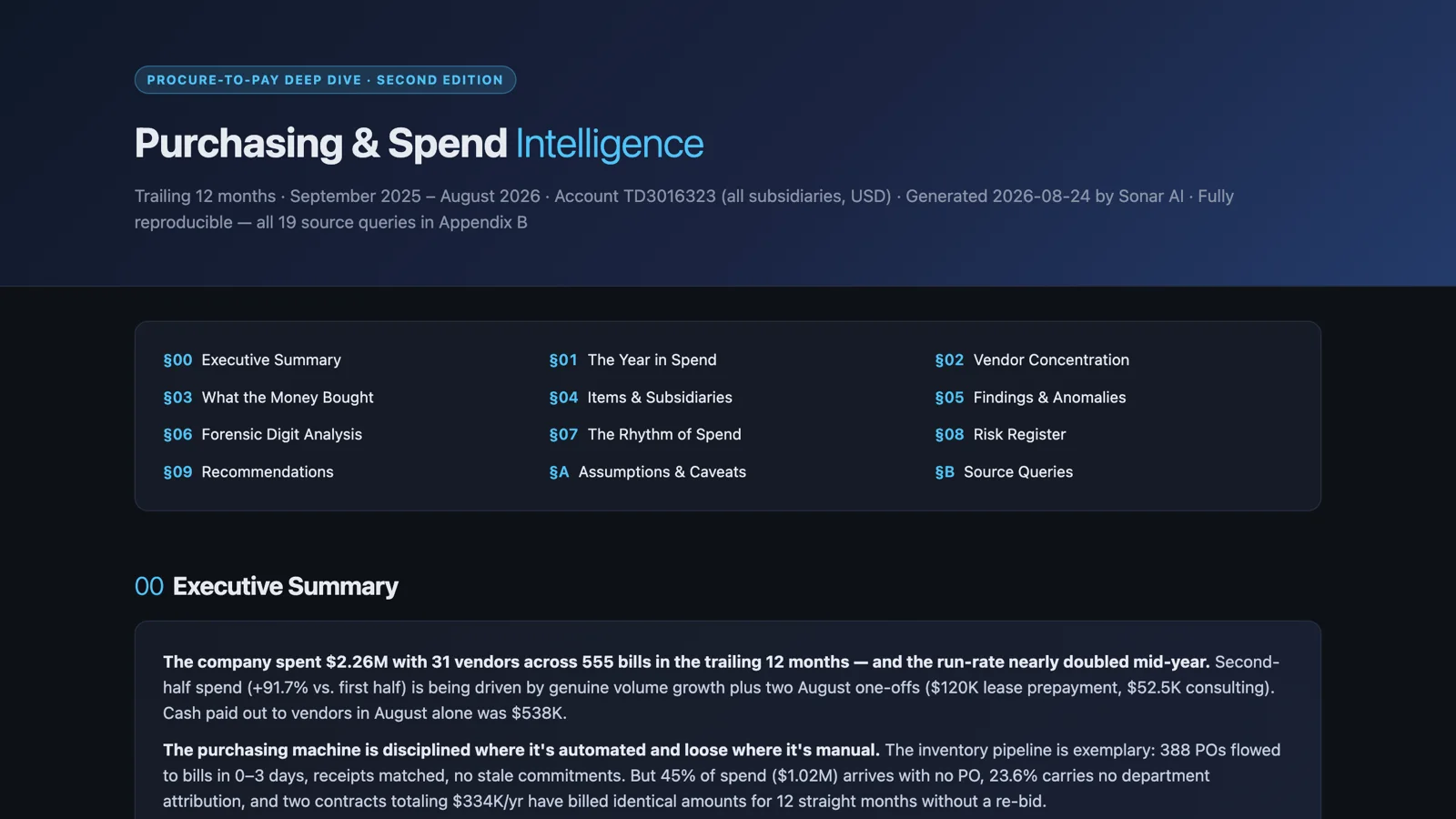
Sample report: Purchasing & Spend Intelligence: Procure-to-Pay Deep Dive.
The Buy-Side Margin Leakage Audit is narrower and goes deeper on one thing: the margin that erodes between the purchase order and the vendor bill. Three workstreams, all from the general ledger. Landed cost capture rate, supplier price drift against purchase price variance, and goods-received-not-invoiced aging with three-way-match exceptions.
The test account had the Landed Cost feature configured and almost never used. Two of 1,072 inventory receipts in six months carried a landed cost allocation. The deeper problem was that freight wasn't being expensed either. It was missing entirely, which means every product margin reported in that window was overstated by the full uncaptured freight and duty burden. Contract pricing was stable on 127 of 128 vendor and SKU combinations, but purchase price variance had jumped twelve times in July, and $12.5K had been billed against purchase orders that were never received.
Sample report: Buy-Side Margin Leakage Audit.
Where the Inventory Sits
The Inventory Risk Grid is one of the free prompts, and it's the one I show people first. One screen, every active inventory item, rendered as a heatmap of velocity against weeks of stock. Fast movers about to stock out sit in the red corner. Stock that hasn't sold in months sits in the blue corner, weighted by the dollars tied up. Hover a tile for on-hand, velocity, weeks of cover, and value at cost. Click it and the item record opens in NetSuite. In the test account, 106 items were dead money, with $631K tied up in them.
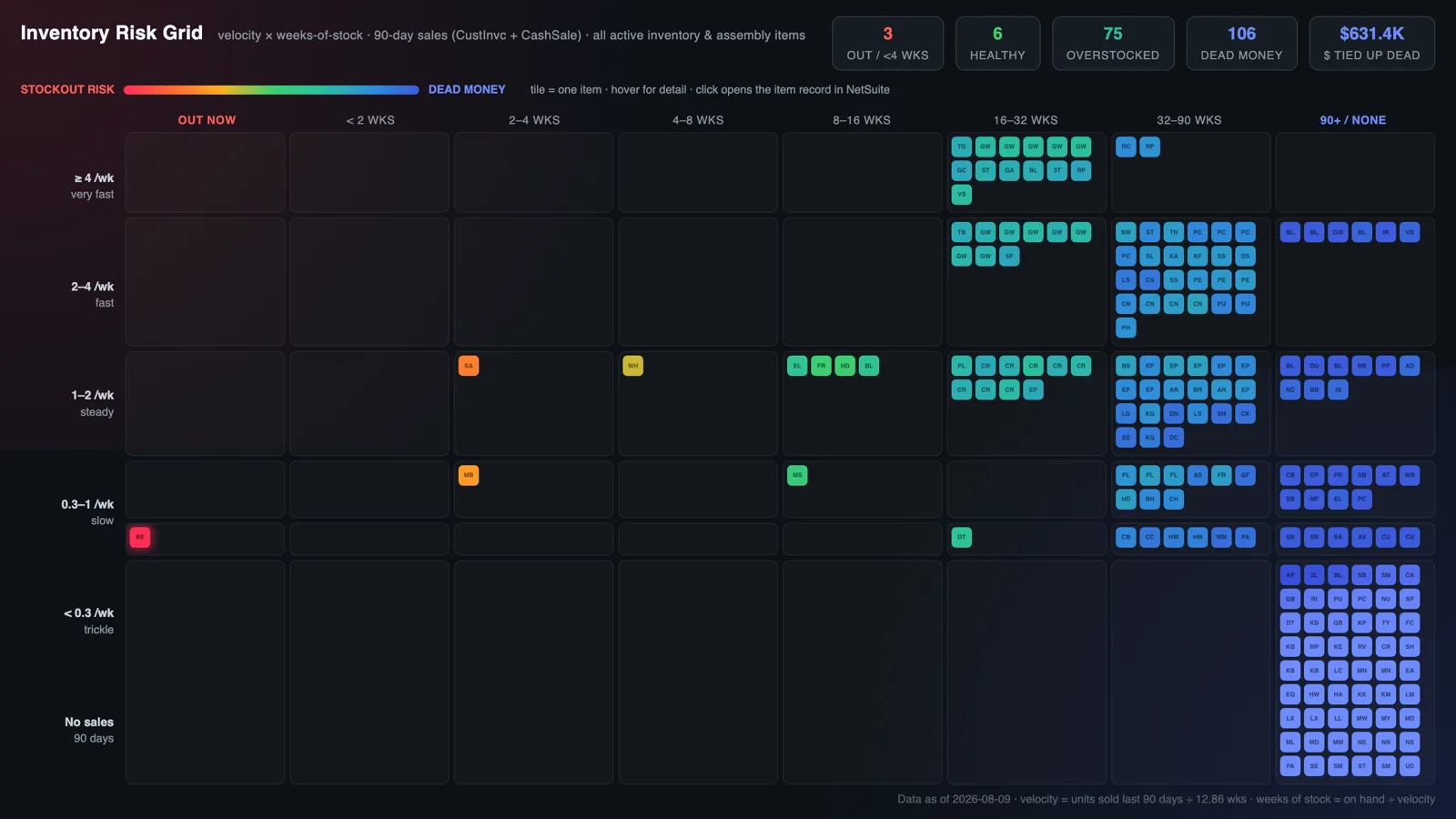
Sample report: Inventory Risk Grid.
Inventory Positioning Analysis asks whether stock is positioned where demand lives, and for most multi-warehouse operators the honest answer is "we're not sure." This prompt geocodes twelve months of fulfillment history using the US Census Geocoder, which is also a demonstration of Sonar calling an external web API and blending outside data with NetSuite data in the middle of an analysis. It ranks every wasteful shipping flow in excess unit-miles, expands each stocking recommendation to the full co-purchased basket so that fixing one problem doesn't create split shipments, and pressure-tests the freight economics against actual billing.
The finding in the test account fit in one sentence: the two coasts were fulfilling each other's backyards. Boston was shipping one item to San Francisco customers across 2,692 miles while San Francisco shipped another to Newark, with a Queens warehouse fifteen miles from that customer. About 28 million excess unit-miles a year. And because shipping charges billed to customers came from a flat-rate table while carrier cost scales with distance, every needless mile came straight out of margin, invisibly. The first phase of the plan was transfers only, at zero capital.
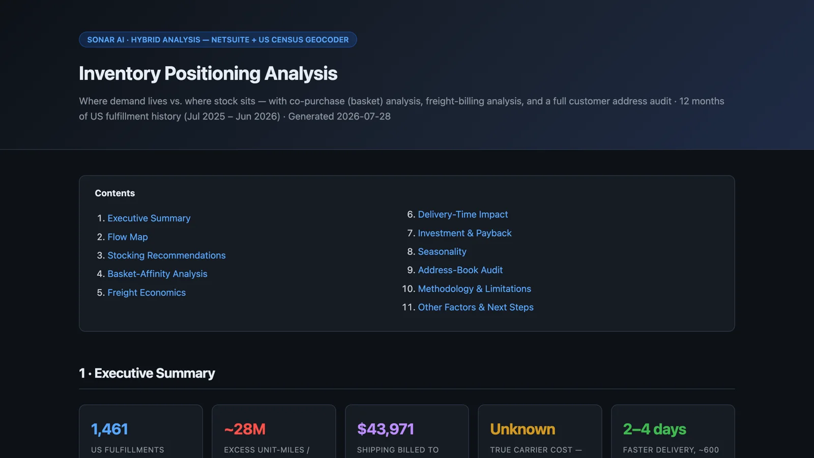
Sample report: Inventory Positioning Analysis with Geographic Demand Mapping.
Two related prompts have their own posts. Negative Inventory Root-Cause Analysis finds the transaction where an on-hand balance broke, and the Pick-Pack-Ship Latency Profile measures how long orders sit at each stage of fulfillment.
Wrapping Up
What these nine have in common is that the data was already in NetSuite. The purchase orders, the receipts, the bills, the work orders, the fulfillments. Nobody had put the pieces side by side, because doing that by hand is a week of spreadsheet work for each question. The prompts do the joining and the arithmetic, and the reports show their queries, so the finding can be checked before anyone acts on it.
All nine are in the Sonar AI Prompt Library. Inventory Risk Grid is free. The other eight are in the paid tier: BOM Cost Sunburst, Component Shortage Dependency Graph, Supply Chain Risk Exposure Review, Supply Promise Anchor Audit, Supply Allocation Logic Evaluation, Purchasing & Spend Intelligence, Buy-Side Margin Leakage Audit, and Inventory Positioning Analysis with Geographic Demand Mapping.