NetSuite knows a great deal about your customers that no standard report shows you. Where the revenue ships. Which quotes quietly die. How far realized prices drift from list. Which customer on tomorrow's delivery route hasn't placed the order they place every week.
The Sonar AI Prompt Library has a growing set of prompts for exactly those questions, and the release earlier this month added several. This post walks through eight of them. Two are free. A second post will cover the rest of the group.
If you're new to this, Sonar AI is an AI agent that runs inside NetSuite. Every prompt in the library is a playbook that I engineered and tested against live NetSuite data, and you run it inside your own account, against your own records.
Customer Financial Performance and Risk Analysis
This is the big one, a full customer-base health check. Net and gross revenue retention, churn, growth, revenue per account, segmented lifetime value, concentration, gross margin, cohort retention curves, and named lists of at-risk and expansion-ready accounts, each with a dollar impact. The prompt's first rule is to discover before computing: survey the account, find how customers are segmented, and find the data quirks before trusting a metric. It also has to list every metric it couldn't calculate and say what data would unlock it.
I ran it against one of my NetSuite test accounts, and the discovery step earned its keep before a single metric was computed. Company-wide revenue for the trailing twelve months was $12.14M, but $10.3M of it posted through 48 summary journal entries with no customer attached. Customer-level analytics were only possible on the $1.84M that was attributed to customers, and the report said so in a box at the top, before anything else.
On that book, the story was a small, excellent core of eleven repeat B2B accounts growing with zero churn, wrapped in a fast-growing layer of one-time buyers. Every one of the 35 new logos acquired since the start of the prior year had bought once and never returned, and that layer was the source of nearly all of the $793K in overdue receivables. The headline growth was real. It was also increasingly built on revenue that was neither recurring nor, so far, collected. The report priced the two highest-value moves, a collections intervention and a repeat-purchase program for new logos, and named the number one account whose revenue had fallen 84 percent quarter over quarter.
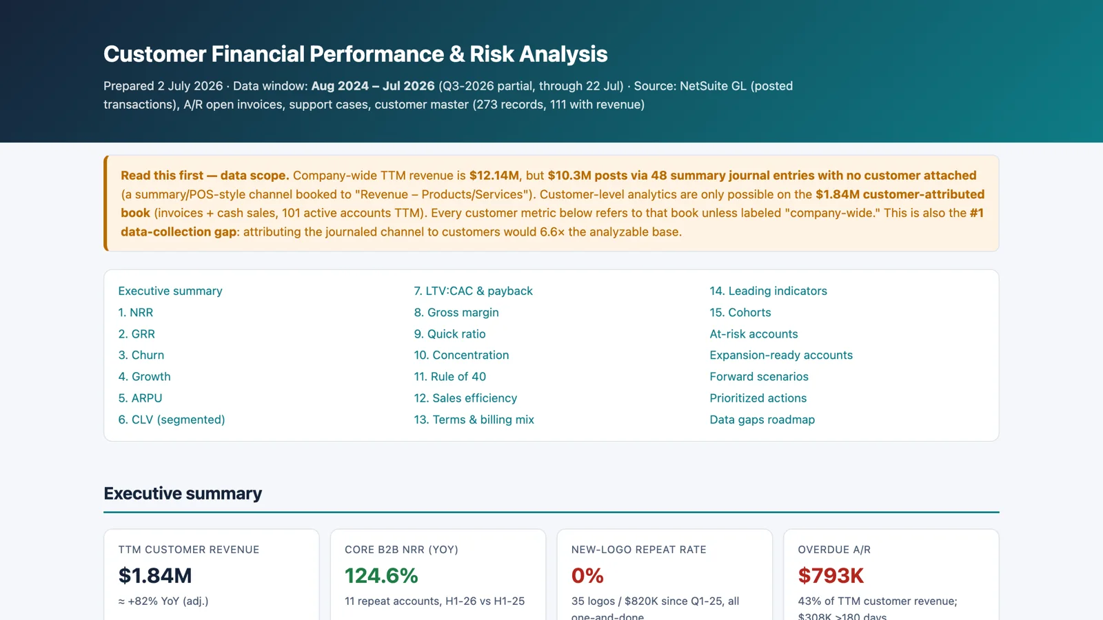
Sample report: Customer Financial Performance and Risk Analysis.
Route-Day Order Gap and Nudge Report
This one was built for route-based distributors, and it answers the question every one of them should ask the evening before a delivery day: which customers on tomorrow's route haven't placed their usual order, and what would they normally order? Route membership comes from the customer record's declared delivery days, not from guessing at ship dates. The usual basket is predicted from trailing order history. The prompt computes each customer's reorder cadence, the weekday they habitually order on, and their next expected order date, then flags any basket items the business can't currently fill and attaches receivables context so the rep words the call correctly.
In the test account, a Monday route had 16 customers, 15 of them with no upcoming order and $32.5K of usual-basket value at stake. The report also noticed that the route had gone from near zero to more than $220K a month in ninety days, which means these were newly activated accounts settling into weekly rhythms. A missed nudge at that stage is a habit formed with a competitor. And it flagged that one account was 44.5 percent of the route's revenue, with a bulk order every couple of weeks that deserved key-account treatment rather than an automated nudge.
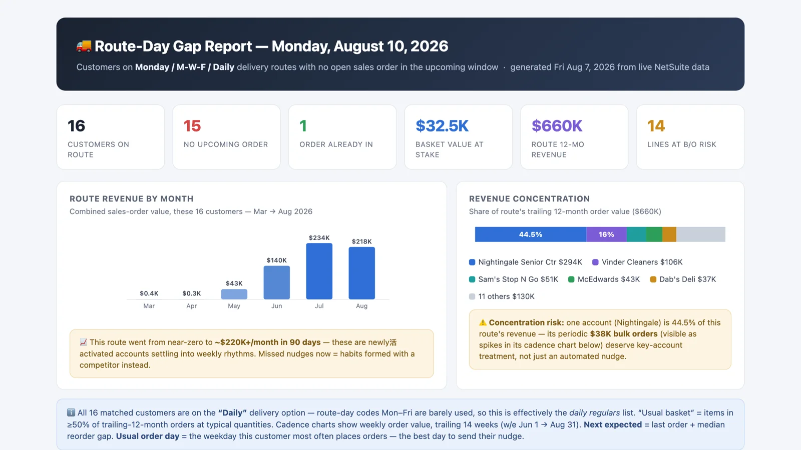
Sample report: Route-Day Gap Report.
Geographic Sales Map
The perennial executive-meeting favorite: an interactive map of where revenue actually ships, built from the shipping addresses on transactions. Bubble size is revenue, color is growth or decline against the prior period, and clicking a geography opens its detail: top customers, top items, trend. It's a simple idea, and it's the chart that gets pulled up first in most of the meetings I've been in where it exists.
Win/Loss and Customer Retention Analytics
You can't see your competitors' win rates, but you can measure your own with precision. This prompt builds the internal half of a competitive-intelligence dashboard: quote-to-order conversion, estimate aging and abandonment, customer churn cohorts, and net revenue retention. Estimates that go stale without becoming orders are a story that sales pipelines rarely tell, and NetSuite has the dates to tell it.
Pricing and Discount Leakage Analysis
The ERP-native answer to "what is our real pricing strategy?" Competitors' pricing is unknowable from your ERP, but your own realized pricing is fully measurable, line by line. The prompt compares realized price with list price on invoice lines, measures discount depth and frequency by customer, item, and rep, and sizes the margin that would be recovered by closing the leakage. Most companies have a pricing policy and a pricing practice, and the gap between them is money.
Segment Mix vs. Target Allocation
The ERP equivalent of an asset-allocation report. Actual revenue and expense mix by segment, whether that's class, department, location, subsidiary, or a custom segment, compared against the target mix from the budget or from stated strategic targets. Variances beyond a threshold are flagged, and the report recommends where to reallocate.
Two Free Ones
Sales Calendar Heatmap Generator renders every day of your sales history as a calendar heatmap, the style you've seen on GitHub, with color intensity for revenue. Add weekday and monthly profiles, and seasonality, dead zones, whale days, and data-quality artifacts all become visible at once. I've found that the artifacts are as useful as the patterns: a day with impossible revenue is usually a batch import or a journal, and it's worth knowing which.
Customer Revenue Bar Chart Race Generator produces an animated race of top customers by cumulative revenue, one frame per month. It turns two years of sales history into a narrative: who compounded steadily, who rose, who faded, and which whales teleported in. It's data storytelling more than analysis, and it's the kind of thing that makes a sales meeting sit up.
Wrapping Up
What these eight share is that none of them needs data to leave NetSuite. The queries run inside the account, the aggregation happens in the database, and the model reads summaries small enough to verify. If you want the single-customer view rather than the population view, the Customer Health Matrix I wrote about last week plots every customer on one chart and is a good companion to the risk analysis above.
All eight are in the Sonar AI Prompt Library. The Sales Calendar Heatmap Generator and the Customer Revenue Bar Chart Race Generator are free. The other six are in the paid tier: Customer Financial Performance & Risk Analysis, Route-Day Order Gap & Nudge Report, Geographic Sales Map, Win/Loss & Customer Retention Analytics, Pricing & Discount Leakage Analysis, and Segment Mix vs. Target Allocation.