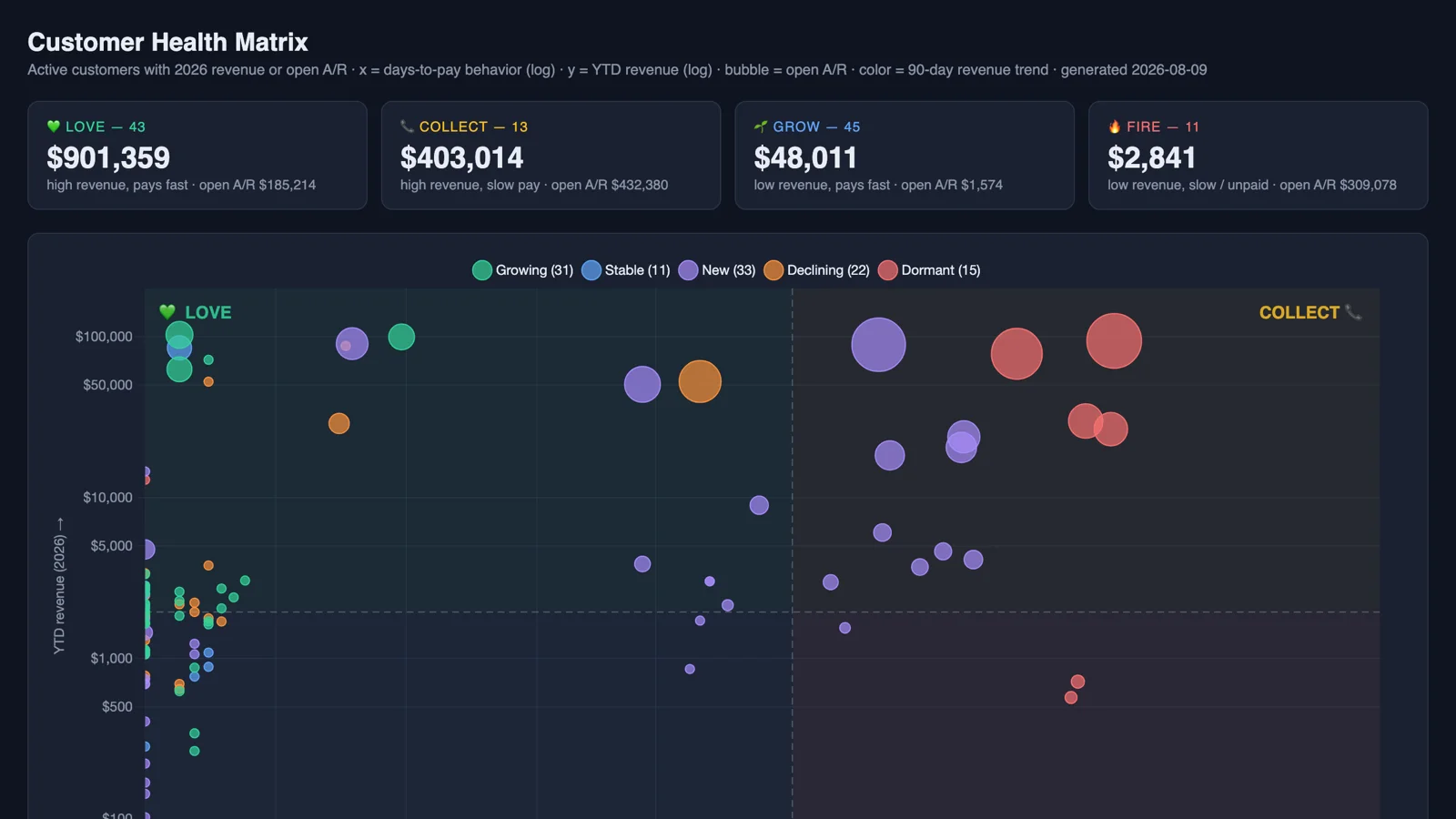
Every customer list hides the same four stories. There are the customers you should love, the ones you should grow, the ones you need to collect from, and the ones you should probably let go. Most companies know which is which, roughly, and almost none of them can show it on one page.
That's what a prompt I added to the Sonar AI Prompt Library this week does. It's called the Customer Health Matrix Builder, and it plots every active customer on a single chart, straight from live NetSuite data, and then answers one question per customer: love, grow, collect, or fire?
If you're new to this, Sonar AI is an AI agent that runs inside NetSuite. Every prompt in the library is a playbook that I engineered and tested against live NetSuite data, and you run it inside your own account, against your own records.
Four Dimensions, One Chart
The chart has four dimensions, and each one is a question you'd otherwise answer with a separate report.
- Horizontal axis - how fast the customer actually pays, measured from the invoices they've settled.
- Vertical axis - year-to-date revenue.
- Bubble size - open receivables, which is the money at risk.
- Color - the 90-day revenue trend: growing, stable, declining, new, or dormant.
Two lines divide the chart into quadrants. The vertical line is the payment threshold, 30 days by default, and the prompt aligns it to the customer terms that dominate in your account. The horizontal line is the median year-to-date revenue of the plotted population. Both can be changed.
Top-left is Love: high revenue, pays fast, protect these. Top-right is Collect: valuable, but the payment behavior needs attention. Bottom-left is Grow: small, but well behaved, and a candidate for more. Bottom-right is Fire: little or no revenue and slow or unpaid balances. Those are candidates for a change of terms, a collections call, or offboarding.
The Rules Behind It
The prompt's hard rules are where the trust comes from. Every plotted value traces to a query that ran against your instance. Every customer's days-to-pay figure is labeled by method: measured, from invoices that were actually paid, or estimated, from the age of the oldest open invoice, which is used only when there's no paid history. The distinction shows up in the tooltips and in the action tables, because a number that looks measured and isn't is worse than no number.
Trend classifications come from two consecutive 90-day revenue windows, and the report states the window dates and the classification band as assumptions. Intercompany activity and the elimination subsidiary are excluded. Inactive customers are excluded. And two things must be flagged for human review no matter what: the total receivables held by customers in the Fire quadrant, and any customer whose oldest open invoice is more than 180 days old, by name and by dollar amount.
What It Found
I ran it against one of my NetSuite test accounts. The Love quadrant held 43 customers and about $901K of year-to-date revenue. Grow held 45 customers who had bought $48K between them and owed almost nothing. Collect held 13 customers with $403K of revenue and $432K of open receivables, which is the conversation about terms.
The Fire quadrant is the one that earns the prompt its keep. Eleven customers, $2,841 of revenue this year, and $309K of open receivables. That's money sitting with accounts that have effectively stopped buying, on invoices that have been aging for a long time. It's the conversation your receivables team needs to have on Monday, and the report puts the names and the dollar amounts in a table so that they can.
You can see the report from this run here: Customer Health Matrix. It's interactive. Hover over a bubble for the customer's detail, and click a legend entry to toggle a trend group on or off.
Who It's For
Any business that runs on invoiced B2B revenue: wholesale and distribution, manufacturing, professional services, agencies, SaaS. This is the ten-minute portfolio review that most of those businesses have been meaning to build for years, and the reason it never gets built is that it needs four reports joined together. Here, the database does the joining, and the chart is the deliverable.
It's in the paid tier of the Sonar AI Prompt Library now, under "Customer Health Matrix Builder."