The monthly management package is where finance work becomes visible. It's also usually assembled in the last two days before the meeting, from a dozen NetSuite reports, a few saved searches, and last month's deck with the numbers changed. The narrative gets written at midnight. The segment analysis gets skipped because it takes too long.
This is the second of two posts on the Financial Statement Analysis and Reporting prompts in my NetSuite AI Prompt Library. The first covered the statements themselves. These six are about what gets built from them: the management report, the period comparison, the segment view, and the trend analysis.
If you're new to the library, it's a set of 150 prompts for NetSuite finance work that I released in January. Each one is a structured system prompt that you paste into Claude or ChatGPT along with your NetSuite data, and it turns the model into a specific kind of analyst with a defined method, a required output, and rules about what it's not allowed to make up.
Building the Package
The Management Report Generator produces the report itself. Financial performance, balance sheet highlights, cash flow, operational metrics, budget performance, and strategic highlights, with variance analysis and action items, from four queries against NetSuite. Its materiality thresholds decide what gets discussed: a revenue variance over $100,000 or 10% is material, an expense variance over $50,000 or 15%, a balance sheet change over $100,000 or 20%. External communications and forward-looking statements are flagged for human review.
The Management Reporting Packager is the assembly step. It aggregates the data, computes the KPIs, runs the variance analysis, compares entities, summarizes cash and liquidity, and packages the whole thing with an executive summary. Its risk framework is about what has changed: a revenue variance over 15%, a margin decline over 5 points, or a cash change over 25% is high risk and gets called out. If you produce a package for more than one entity, this is the prompt that keeps them consistent.
Comparing and Trending
The Period Comparison Analyzer compares any two periods line by line, separates volume from price, sorts variances by materiality, and explains the drivers with the evidence attached. It checks first that the periods are comparable, same length and same accounting treatment, because a comparison of periods that don't match will be confidently wrong. Revenue variances above 10% or $100,000 are material; margin moves above 3 points are material.
The Trend Analysis Tool takes the longer view. Revenue, expense, and profitability trends over many periods, seasonality detection, anomaly flagging, trajectory projection, and inflection points. It reports the statistical quality of what it finds: an R-squared above 0.8 is a strong trend, below 0.5 is noise, and a seasonality pattern is only called a pattern if it's clear. Trend interpretations and projections are flagged for review before anyone plans against them.
Segments
The Profitability Analysis by Segment is the prompt for the question "which parts of the business make money?" It builds a P&L by class and by department from NetSuite, ranks the segments, computes revenue contribution and margin, analyzes cost structure and mix, and looks for cross-subsidization, where one segment's costs are quietly being carried by another. Segments above 10% of revenue get full analysis; 5 to 10% get a summary; below 5% are aggregated. Any segment exit, major pricing change, or reallocation of more than 20% of resources is for a person to decide.
The Segment Reporting Analyzer is its compliance cousin, for companies that report segments externally. It identifies the segments the way the chief operating decision maker sees them, aggregates the financials, reviews allocations, reconciles segments to the consolidated statements, and checks customer concentration. Unallocated amounts over 15% and reconciling items over 5% are high risk; a customer over 25% of revenue is a concentration to disclose.
All six are in the NetSuite AI Prompt Library, under Financial Statement Analysis and Reporting.
Update, September 2026
I ran the Profitability Analysis by Segment from this group against one of my NetSuite test accounts, with the queries executed through Chartstone and the analysis done by Claude, and formatted the report to one of my branding guidelines. Here's what it found.
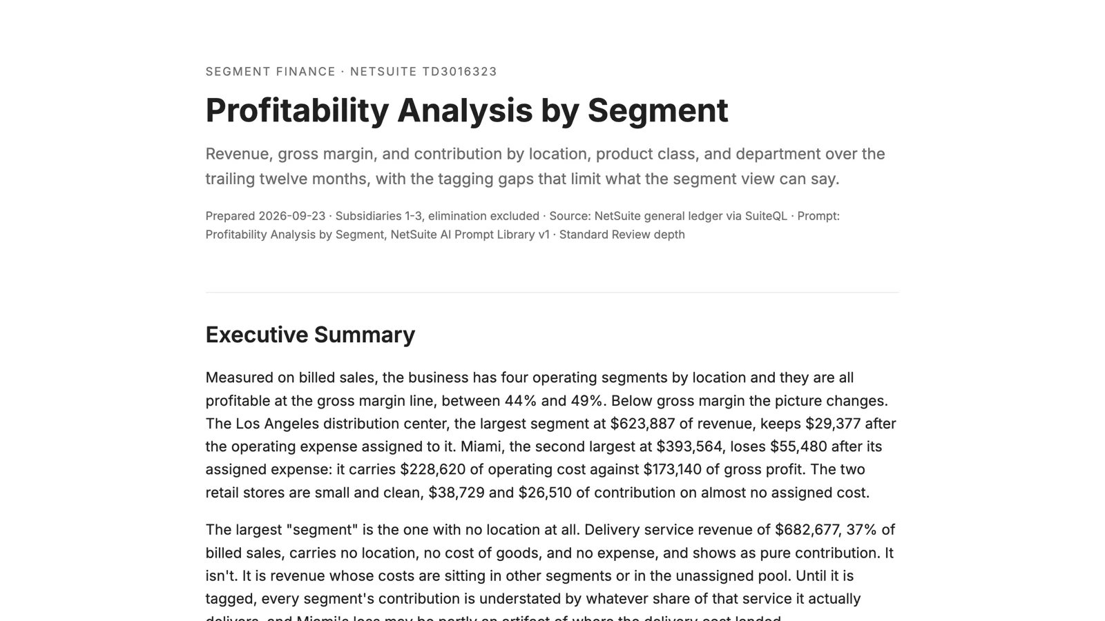
The prompt's queries read the whole ledger by class and department. In this account, 85% of income and 91% of cost of goods are posted by journal entries that carry no class, no department, and no location, so that view shows one "Unassigned" segment holding 91% of revenue and tells you nothing. The report said so at the top, switched to billing documents and their cost postings, which are fully tagged, and picked location as the primary dimension because it's the only one this account tags consistently on revenue, cost, and expense alike.
On that basis, all four locations are healthy at the gross margin line, between 44% and 49%. Below it, the Los Angeles distribution center keeps $29,000 after the operating expense assigned to it, and Miami loses $55,000: it carries $229,000 of operating cost against $173,000 of gross profit. The two retail stores show clean contributions of $39,000 and $27,000 on almost no assigned cost, which the report treated as a warning rather than good news, because store costs are booked somewhere without a location.
The largest segment, at 37% of billed revenue, is the one with no location at all: the delivery service item, which has no cost and no expense attached and therefore looks like pure contribution. The report's conclusion was that the Miami loss is a data-quality finding first and a business finding second, and that no decision about Miami should be made until the delivery cost and the store expenses are tagged to where they belong. That's a harder answer than "close Miami," and it's the right one.
You can read the full report here: Profitability Analysis by Segment. The names and numbers are test data.