A table can tell you a fact. An animation can make a room understand it.
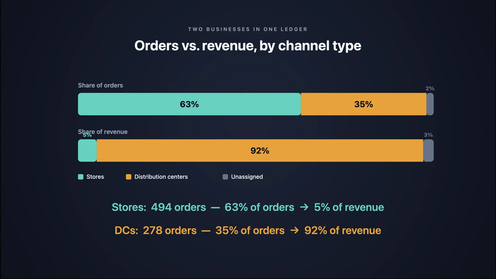
The Order-to-Revenue Motion Brief takes the single strongest finding in an account's order flow and renders it as a 24-second animation, one second per month, in which every dot is a real sales order landing on the location that fulfilled it. On my NetSuite test account, the finding it chose was that the account is two businesses in one ledger. Two retail stores take 63% of the orders and produce 5% of the revenue. Two distribution centers take 35% of the orders and produce 92%.
I knew that number before I built the prompt. I'd seen it in the Instance Integrity Diagnostic and again in the Process Flow Forensics map. What I hadn't done was watch it happen, and the difference is bigger than I expected.
It went into the Sonar AI Prompt Library in September. If you're new to this, Sonar AI is an AI agent that runs inside NetSuite. Every prompt in the library is a playbook that I engineered and tested against live NetSuite data, and you run it inside your own account, against your own records. Nothing leaves the account, and nothing is written to it.
What You See
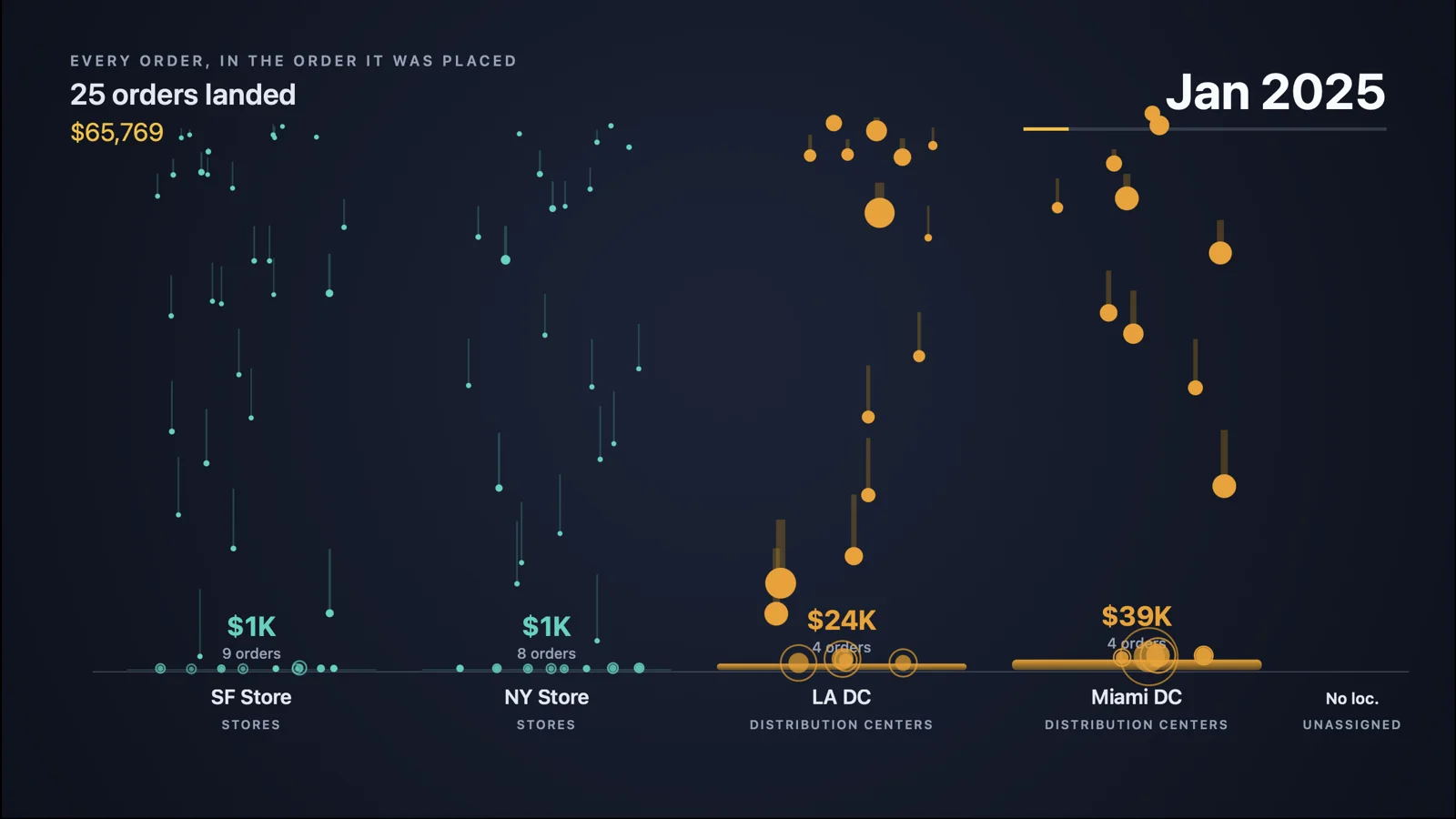
The animation opens on January 2025. Twenty-five orders have landed, $65,769 in total, and the dots are falling onto four locations: the San Francisco store, the New York store, the Los Angeles distribution center, and the Miami distribution center. The store dots are small and teal and there are a lot of them. The distribution-center dots are large and amber and there are a few. A running counter at the top left tracks orders landed and revenue to date. A month label at the top right advances once a second.
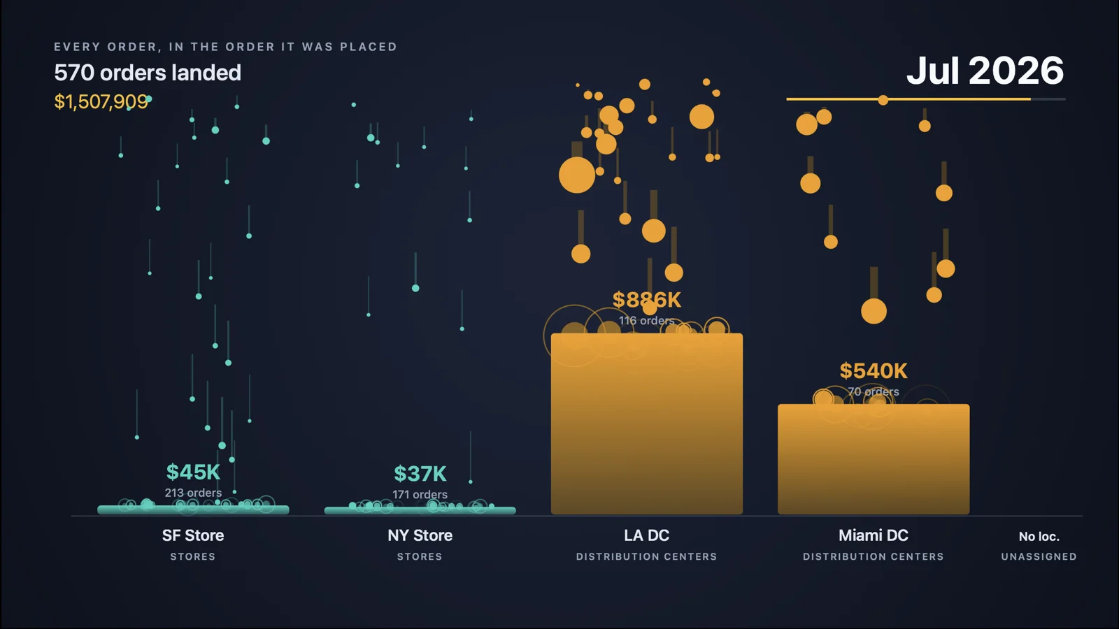
By July 2026, 570 orders have landed and revenue stands at $1,507,909. The two store columns have accumulated 213 and 171 orders and are each sitting on a thin sliver of revenue, $45K and $37K. The Los Angeles column has 116 orders and $886K. Miami has 70 orders and $540K. The amber bars have grown into towers, and the teal ones haven't grown at all.
Then the closing card: orders versus revenue, by channel type. Stores, 494 orders, 63% of orders, 5% of revenue. Distribution centers, 278 orders, 35% of orders, 92% of revenue.
That's the whole brief. There's no narration and no chart junk. The dots do the arguing.
Why I Built It This Way
Every other report in the library is a document. This one is a video, or close enough to one, and it's built for a specific moment: the point in a leadership meeting where someone says that the stores are where the volume is, and someone else says that the volume doesn't matter, and the conversation stalls because both of them are right.
Watching 494 store orders fall for 24 seconds and pile up into 5% of the revenue settles that faster than a slide would. It also makes a second point without saying it. The store orders are real work. Somebody picked, packed, and rang up every one of those dots. The question the animation leaves in the room is what all of that work costs, and whether the 5% covers it. I think that it's the right question, and I'd rather have the room arrive at it than have me put it on a slide.
How to Use It
The output is a 1280 by 720 web page. It opens black, and there's a five-second lead-in before the animation starts, which is there so you can start a screen recorder during the black and end up with a clean clip. Press R to replay. Add a loop parameter to the URL and it loops. Drop the recording into a deck, or just put the page on the screen and press play.
The prompt picks the finding. On the test account it picked channel mix, because that was the strongest contrast in the order flow. On an account where the strongest finding is something else, a single customer, a single product line, a single region, the animation will be built around that instead. The dots are always real orders. Nothing is simulated, and the totals on the closing card are the same numbers the other reports in the series compute.
Wrapping Up
I don't think that every finding needs an animation. Most of the reports in the library are dense on purpose, because their readers are controllers and auditors who want the appendix. This prompt exists for the other audience, the one that needs to understand a single thing in under a minute and then make a decision about it.
The Order-to-Revenue Motion Brief is in the paid tier of the library. The sample animation from the test account is online, and I covered the whole September release in a separate post.
Show it to your leadership team, and the conversation about what small orders cost will start itself.