NetSuite knows a lot about a factory. Every work order, every component issue, every assembly build, every completion, and every variance posting is in there. What it doesn't do is show you the factory. You get lists and you get GL accounts, and the picture of where value concentrates, where it leaks, and where costs are drifting is something you assemble in your head, or in a spreadsheet, if you assemble it at all.
I've been building a set of manufacturing prompts for the Sonar AI Prompt Library. The work center load heatmap was the first one I wrote about. Here are three more, and they'll all be in the next release. Each one answers a question that every manufacturer on NetSuite eventually asks and that no standard report answers directly.
If you're new to this, Sonar AI is an AI agent that runs inside NetSuite. Every prompt in the library is a playbook that I engineered and tested against live NetSuite data, and you run it inside your own account, against your own records.
What the Factory Is
The Factory Flow Sankey Builder draws the value chain as a Sankey diagram, with dollars flowing left to right: vendors and raw inputs, then component consumption, then assemblies, then finished goods, then the customers they went to. Ribbon width is the amount. Scrap and variance leak off to the side at each stage.
The hardest rule in the prompt is about a query mistake that I've seen more than once. If you join transaction lines and accounting lines in the same query, the accounting amounts get multiplied by the line count, and every total in the diagram is wrong by a factor that looks plausible. The prompt requires a fan-out-free check of every total before it trusts one, and it has to disclose in the diagram's own notes anything it rescaled or excluded.
In one of my NetSuite test accounts, the trailing twelve months came to $1.14M of production cost, most of it raw material, against $1.53M of external revenue, with 415 builds. Scrap and variance leaked $15K, under 1.4 percent of production cost, which is healthy. The interesting part was the toggle. By cost, one circuit board assembly and one outside-processed item dominate, about three-quarters of the production dollars. Flip the ribbons to margin and the story inverts. A portable ultrasound earns a 99 percent margin on a tiny build cost, and the circuit board shows a deeply negative external margin, because it's a sub-assembly consumed by higher-level builds and its cost isn't matched by outside sales. The prompt flags that as a costing signal rather than counting it as a loss, which is the right call. It also hid a $6.98M intercompany transfer by default, since it was fifteen times the largest real customer and not a sale.
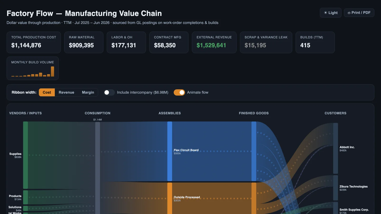
Sample report: Factory Flow: Manufacturing Value Chain.
How Much of What We Planned Did We Build
The Work Order Yield and Batch Loss Analysis compares planned quantity to built quantity on every finished work order, ranks the variances, and then does something most yield reports skip: it classifies them. Under-builds are the shrinkage story. Over-builds are usually planning data that never got updated, and they're inventory created at cost, not profit, so the prompt refuses to present them as an offsetting gain without saying so. Closed orders with nothing built are almost always cancellations, and they're called out rather than averaged into the loss.
Financial impact is reported two ways, side by side. The estimated lens values the shortfall at the assembly's average cost. The authoritative lens is what NetSuite actually booked to the manufacturing variance accounts when work-in-process closed. The two differ, and the prompt has to explain why. A short batch that consumed proportionally fewer components shows shrinkage in the first lens and nothing in the second, because that loss cost nothing beyond the smaller output. Conflating the two is the classic error here.
In the test account, 130 of 138 finished work orders built exactly to plan. Five were under-built, 77 units short, worth about $267 at cost. Three were over-built by 52 units. The GL-booked variances netted to a favorable $26.83. The report's bottom line was that yield variance wasn't a material financial issue in this account, and that the signal was operational hygiene. I'd rather have a prompt that says that than one that dresses up $267 as a finding.
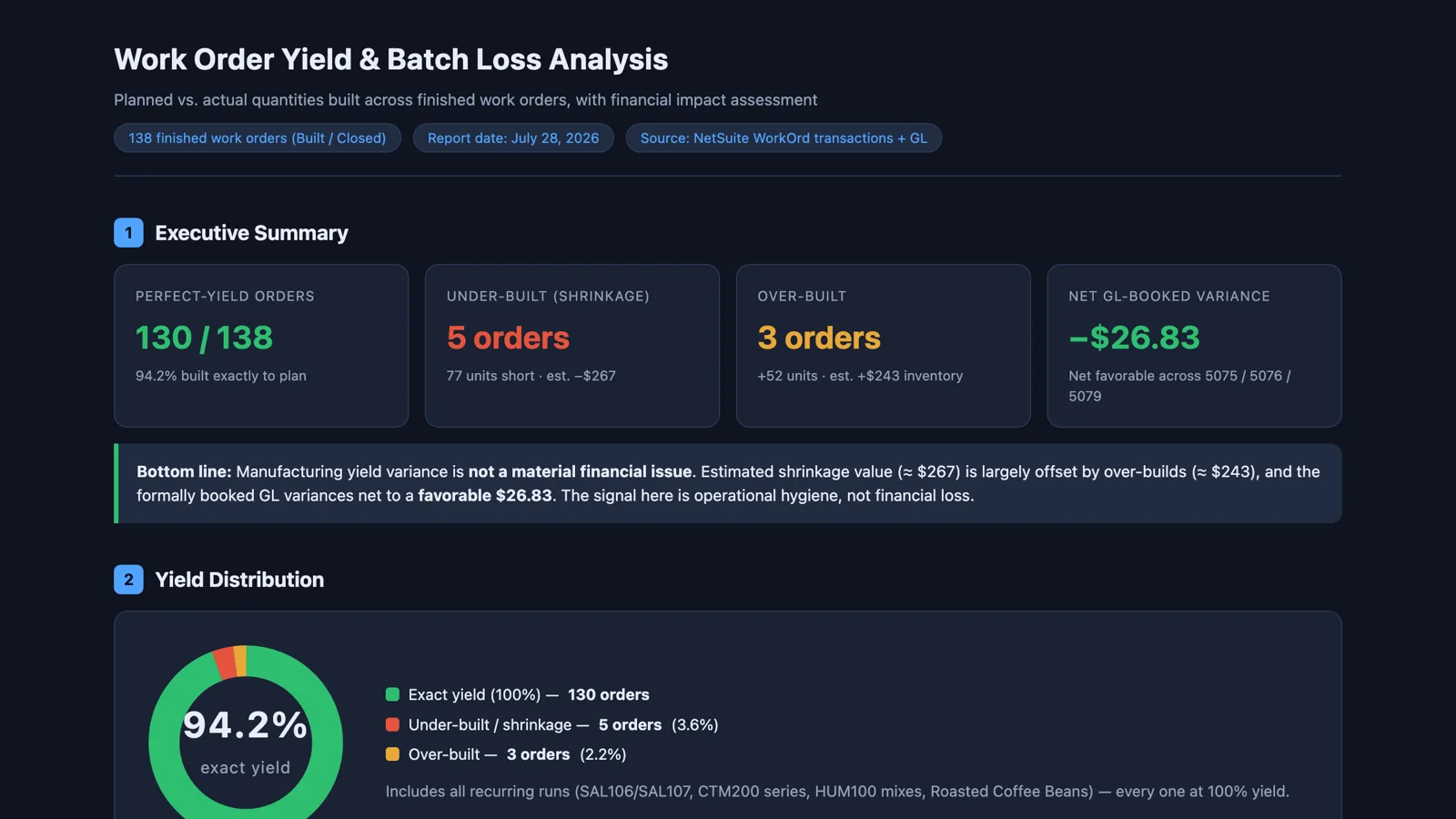
Sample report: Work Order Yield and Batch Loss Analysis.
Which Recipes Got More Expensive
The Assembly Ingredient Cost Creep Analysis compares component consumption costs on assembly builds year over year, and then explains the change. The costs come from build transactions, not work orders, because work order lines carry quantities but no cost. Each assembly's per-unit change is split into price movement and usage or yield drift. Price movements are verified against vendor bills, because average-cost layering can shift consumption cost with no vendor price change at all. And selling prices come in from invoices, so the result is reported as what it really is, a margin story.
The rule I care most about here is that yearly averages lie. A "+32 percent year over year" can hide a mid-year step-change blended across cheap months and expensive ones. So for every component that moved, the prompt pulls the per-bill price by month and classifies the movement: a step-change means a vendor repriced and you negotiate, and gradual drift means the market moved and you hedge or reformulate. The classification changes the action, so it's mandatory.
The test account has a salsa line, and this is exactly what it found. It wasn't creep. The sole supplier of limes repriced them from $0.00105 to $0.025 per lime on the September 2025 bill, about 24 times, and every bill since has been at the new rate. The yearly average said +32.4 percent, because 2025 blended two cheap months with four expensive ones. Meanwhile, the jar cost went up 1.5 percent while its average selling price fell 4.9 percent, and gross margin went from 33.2 percent to 28.7 percent. The prompt also flagged one anomaly: the February 2026 bill reverted to the old price. That's either a billing error in your favor or evidence that the old price is still available if you ask. And it noted that limes had one vendor, 26 bills, and no alternate, ever. The report ends with a what-if slider for the lime price, so you can see what a renegotiation is worth before you make the call.
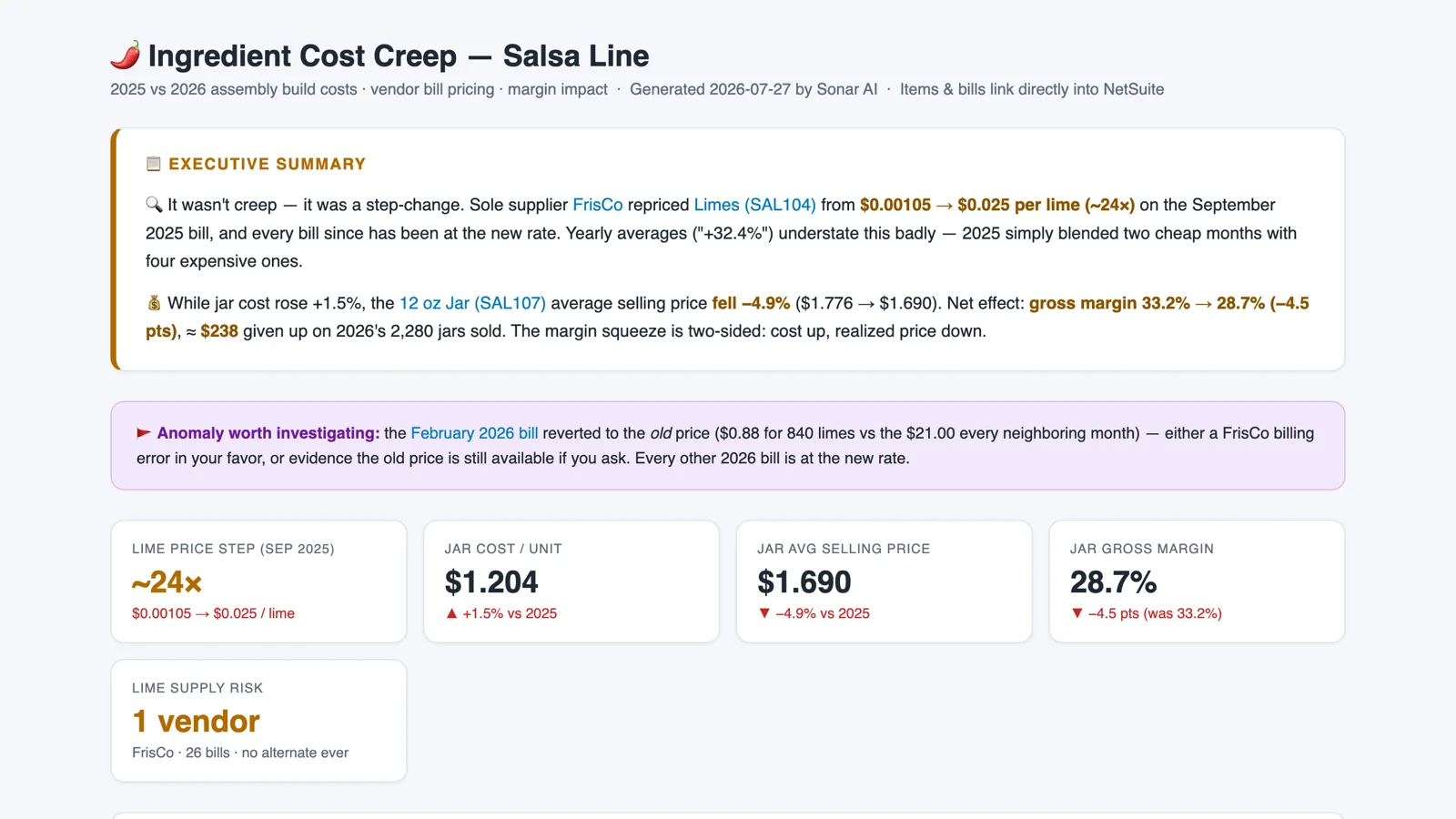
Sample report: Ingredient Cost Creep: Salsa Line, 2025 vs. 2026.
What They Share
All three are read-only. They recommend, and a person decides. All three do their arithmetic in code rather than in the model, and every number in every report traces to a query that's printed in the report. And all three disclose what they left out: the intercompany transfer, the in-process work orders, the assemblies that weren't built in both years. I think that the disclosures are as valuable as the findings. A report that tells you what it didn't count is one you can hand to someone else.
These three prompts will be in the next release of the Sonar AI Prompt Library, alongside the heatmap. I'll post here when it's out.