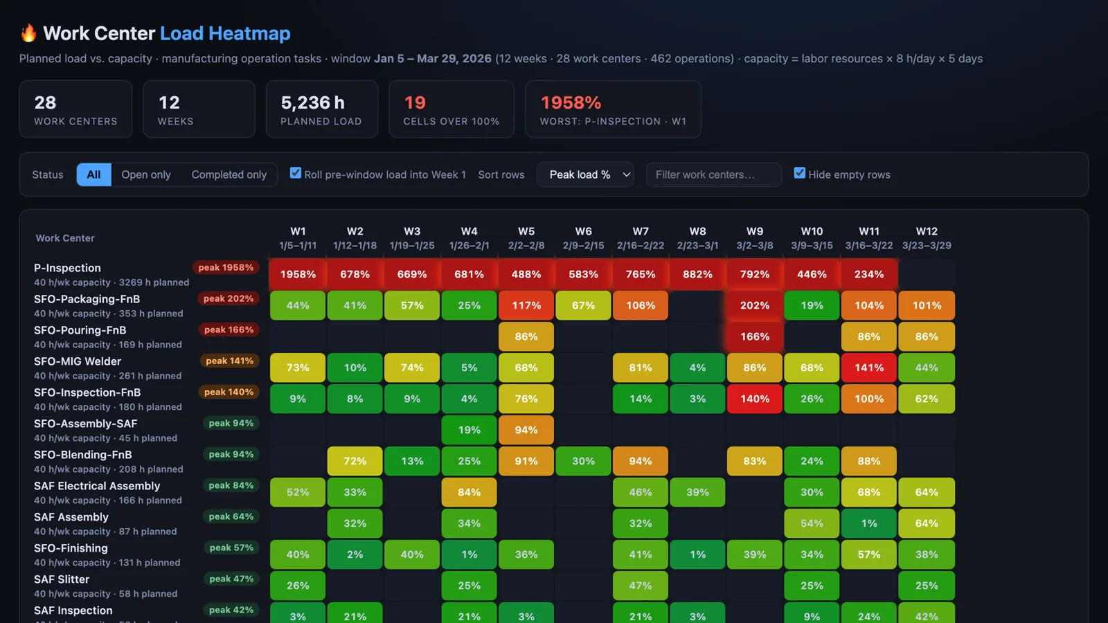
A work center that will be overloaded three weeks from now doesn't show up in any standard NetSuite report. The operation tasks are all there, with their hours and their dates, but nothing puts them next to the capacity of the work center they're scheduled on. So the overload shows up later, as a late order, and by then the options are overtime or an apology.
I've been working on a prompt that fixes that, and it'll be in the next release of the Sonar AI Prompt Library. The idea is simple: work centers down the rows, weeks across the columns, and each cell colored by planned load divided by capacity. Simple data, dramatic rendering. An overloaded work center shows up as a burning red column weeks before the schedule slips.
If you're new to this, Sonar AI is an AI agent that runs inside NetSuite. Every prompt in the library is a playbook that I engineered and tested against live NetSuite data, and you run it inside your own account, against your own records.
Where the Numbers Come From
The load side comes from manufacturing operation tasks: the work center, the start and end dates, the estimated hours, and the status. The capacity side is derived, and the prompt has to say how. The default model is labor resources on the work center, times hours per day from its work calendar, times the number of working days that calendar has flagged. If the account has a custom capacity field on the work center, the prompt prefers it and says so in the report.
The rule that matters most is proration. An operation that spans three weeks contributes a share of its hours to each weekday it touches. It doesn't get dumped into its start week. That sounds like a detail until you meet an inspection task with 280 hours on it that runs for two months, which is a real thing in the data I've worked with. Dump that into one week and you've invented a spike that doesn't exist.
Choosing the Window
Before it builds anything, the prompt profiles open load by month. I added that step after watching what happens without it. Demo accounts and poorly maintained ones carry hundreds of past-dated open operations and very little freshly scheduled work, so a literal "next twelve weeks from today" heatmap renders empty and tells you nothing.
So it offers two ways to anchor the window and lets you choose. One is a forward window with all of the overdue open load rolled into week one, which is what MRP would do with past-due work. The other is a data-rich window anchored on the densest scheduled period. If the load in the chosen window is trivial, it delivers the horizon profile instead of a misleading grid.
What It Showed
I ran it against one of my NetSuite test accounts: 28 work centers, twelve weeks, 462 operations, and 5,236 hours of planned load. Nineteen cells came in over 100 percent of capacity.
The worst was an inspection work center at 1958 percent in week one, with 3,269 hours planned against 40 hours a week of capacity. Most of that is carried-in backlog rolled forward, and the report marks it that way, but the row stays red for eleven of the twelve weeks. That's a work center that can't recover on its own. A food and beverage packaging line peaked at 202 percent in week nine, with two more weeks over 100 percent behind it. Everything else sat comfortably under capacity, which is the point of the grid. You don't read 336 cells. You look for the red ones.
The Report
The deliverable is one self-contained HTML file. A KPI strip at the top gives the work-center count, the week count, the total planned hours, the number of cells over 100 percent, and the worst cell. Cells over 150 percent pulse. Hovering a cell shows the hours against capacity and the five work orders driving them, and clicking it opens a panel with the full breakdown: operation, customer, hours, status, and whether the load was carried in from before the window.
The controls are the ones a planner would want. A status toggle for all, open only, or completed only, where open only is the true forward-looking view. A checkbox for rolling pre-window load into week one. Sort by peak load, total hours, or name. A text filter for work centers, and a toggle to hide empty rows. The methodology note in the file states the capacity model, the proration rule, the anchoring choice, and the queries.
You can see the heatmap from this run here: Work Center Load Heatmap.
Who It's For
Plant managers and production planners running NetSuite manufacturing with work orders and routings. If you've ever found out about a bottleneck from a customer, this is the early warning that was missing. The data was always in the account. It just needed to be put next to capacity and colored.
This prompt will be in the next release of the Sonar AI Prompt Library. I'll post here when it's out.