Every leadership team wants a dashboard. Most of them end up with a slide that somebody in finance updates by hand on the first of the month, with numbers that don't quite tie to the ledger and definitions that nobody wrote down. Then a board member asks how DSO was calculated, and the room goes quiet.
The Operational Intelligence category in my NetSuite AI Prompt Library has eight prompts, split across two posts. This one covers the four that build the management view: a KPI dashboard, a benchmark comparison, a capacity plan, and a department scorecard. The second post covers the four that measure operations: location comparison, order fulfillment, process cycle time, and resource utilization.
If you're new to the library, it's a set of 150 prompts for NetSuite finance work that I released in January. Each one is a structured system prompt that you paste into Claude or ChatGPT along with your NetSuite data, and it turns the model into a specific kind of analyst with a defined method, a required output, and rules about what it's not allowed to make up.
KPI Dashboard Generator
The model becomes a business intelligence analyst whose job is to select the metrics, compute them, and define them. It works through six blocks: financial KPIs such as revenue growth, margins, liquidity ratios, and DSO, DPO, and inventory turns; operational KPIs; customer KPIs; sales KPIs; trend analysis; and target management against budget. Four queries ship with it, for core financial KPIs by month, profitability by month, the efficiency ratios, and customer metrics.
The part I'd stress is the definitions. Every KPI on the dashboard has to carry its formula, its data source, and its period, so the "how was that calculated" question has an answer printed next to the number. The thresholds are stated too: gross margin above 40% is strong and below 25% is a concern, DSO under 30 days is strong and over 45 is a concern, revenue growth over 15% is strong, a current ratio over 2.0 is strong. You'll change those for your business, and the point is that they exist rather than being implied.
Benchmark Comparison Tool
This is the KPI dashboard turned outward. The model becomes a strategic analyst and compiles the company's financial, operational, growth, and cost structure metrics from NetSuite, then compares them with benchmarks you supply, because the prompt is not allowed to invent industry figures. Four queries pull the internal side. The output positions each metric by quartile, top quartile is a competitive advantage, below median is an improvement opportunity, and sizes the gap in dollars, so that "we're below median on gross margin" becomes "closing half the gap is worth this much a year."
Capacity Planning Assistant
The capacity prompt looks forward. The model becomes a capacity planning analyst and builds from transaction volume trends and revenue trends to a demand forecast, then compares it with current capacity to find the gap, and prices the investment needed to close it under several growth scenarios. The materiality framework is in shortfall and dollars: a capacity gap over 20% or an investment over $500,000 gets detailed analysis, under 10% and $100,000 gets a note. Three queries ship with it, for transaction volume, revenue trend, and order backlog. The scenarios are the deliverable, and each one has to print the assumptions it rests on.
Department Performance Scorecard
The department prompt asks the question that department heads dread and CFOs love: what does each department contribute? The model becomes a management accountant and builds revenue, expense, and contribution by department, budget variance where budgets exist, efficiency metrics such as cost per transaction, and a comparison across departments with a ranking. Four queries, one for each. Contribution margin over 20% is strong and under 10% is a concern; budget variance over 10% is a concern. Rankings are flagged for human review, because a department that looks expensive on the scorecard is sometimes the one keeping the others running.
Who They're For
CFOs and controllers who own the monthly management pack. CEOs who want one page. And department heads who'd like to see the scorecard before it's shown to them. All four are in the NetSuite AI Prompt Library, under Operational Intelligence.
Update, September 2026
I ran the KPI Dashboard Generator prompt from this group against one of my NetSuite test accounts, with the queries executed through Chartstone and the analysis done by Claude, and formatted the report to one of my branding guidelines. Here's what it found.
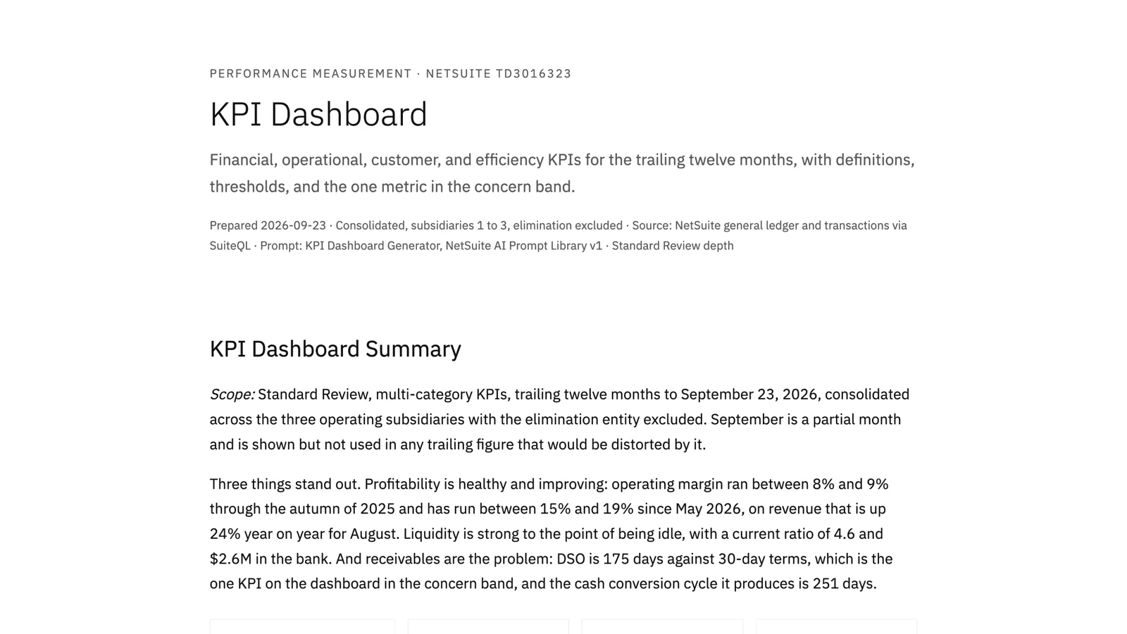
Ten KPIs, each with its formula printed and its threshold from the prompt. Trailing twelve-month revenue of $12.2 million, gross margin 39.5%, operating margin 13.4%, August revenue up 24% on the year before. Gross margin has held in a 35% to 40% band for a year while operating expense stayed flat at $240,000 to $280,000 a month, so every point of the operating margin improvement since spring came from revenue against a fixed cost base. The dashboard says that in one sentence, and it's the sentence a CEO wants.
One metric sits in the concern band, and it's the right one. DSO came out at 175 days against 30-day terms. The report doesn't leave it there; it says the driver is a small number of accounts that have never paid rather than a general slowing of collections, and puts that on the 30-day action list. It also notes that the current ratio of 4.6 is more than twice the "strong" threshold, and that a business holding two years of operating expense in current assets is safe but not putting its balance sheet to work.
The qualifications are the part I'd point to. The report flags that most of the recognized income in a recent quarter was posted by journal rather than by invoices, and shows the billing-document revenue separately, which roughly doubled over the year. It flags that the GL receivables balance doesn't reconcile to open invoices. And it reports the "new customers in twelve months" metric as uninformative, because every customer record in the account was created within the year, rather than quietly presenting a 100% that means nothing. A dashboard that tells you which of its numbers to trust is worth more than one that's uniformly confident.
You can read the full report here: KPI Dashboard. The names and numbers are test data.