Every close produces the same question. Revenue is up, or down, or flat, and somebody wants to know why. The answer is usually in NetSuite, spread across the income statement, the item detail, and the customer list, and pulling it together is a few hours of work that gets done in a hurry and thrown away the next month.
The Period Comparison Analyzer is the prompt in my NetSuite AI Prompt Library for that job. It compares any two periods, month over month, quarter over quarter, or year over year, and it explains the difference rather than just reporting it.
If you're new to the library, it's a set of 150 prompts for NetSuite finance work that I released in January. Each one is a structured system prompt that you paste into Claude or ChatGPT along with your NetSuite data, and it turns the model into a specific kind of analyst with a defined method, a required output, and rules about what it's not allowed to make up.
Comparable Before Compared
The first thing the prompt does is check that the periods can be compared at all. Same length. Same accounting treatment. No structural changes in between, such as an acquisition or a new segment definition. These are listed as assumptions that the report has to state, because a comparison built on periods that don't match will be confidently wrong.
Then it works through the comparison in six blocks. Revenue, with volume separated from price. Expenses by category, with fixed and variable behavior noted. Profitability at the gross, operating, and net lines. The balance sheet, if you give it one. Operational metrics. And finally the variance explanation, which classifies each driver as recurring or one-time, internal or external, controllable or not.
Materiality Is Built In
The part of this prompt that I think earns its place is the materiality table. A revenue variance is material above 10% or $100,000, notable between 5% and 10%, and immaterial below 5%. Expenses have their own thresholds, margins are measured in points, and balance sheet changes in percent. The model has to sort every variance into one of those bins before it explains anything.
That sounds like a small thing. In practice it's the difference between a report that explains three variances that matter and one that explains forty that don't. You can change the thresholds. The point is that they exist, and that the model can't decide on its own that a 2% change in office supplies deserves a paragraph.
The Queries and the Output
Four SuiteQL queries ship with the prompt: a P&L comparison by account, revenue by category with the price and volume effects computed in the query, a balance sheet comparison, and a customer comparison that tags each account as new, lost, or existing. With an MCP connector the model runs them. Without one, you run them in the SuiteQL Query Tool and paste the results in.
The output order is fixed: executive summary, revenue comparison, expense comparison, profitability analysis, key drivers, and then the appendices, data lineage and period definitions. Every variance carries its calculation. Every driver carries its evidence, labeled with the analysis method that produced it. And a short list goes to a person: variance explanations that will be communicated outside the company, and any strategic implication, are flagged for human review.
Who It's For
Controllers at close. FP&A analysts building the quarterly review. Anyone who has to stand in front of a board and say why the number moved. And if you're a consultant, it's a fast way to understand a business you've just met, because a good period comparison is a summary of what the company is doing differently.
It's in the NetSuite AI Prompt Library, under Financial Statement Analysis and Reporting.
Update, September 2026
I ran this prompt against one of my NetSuite test accounts, comparing the second quarter of 2026 with the second quarter of 2025. The queries ran through Chartstone, Claude did the analysis, and the report was formatted to one of my branding guidelines. Here's what it found.
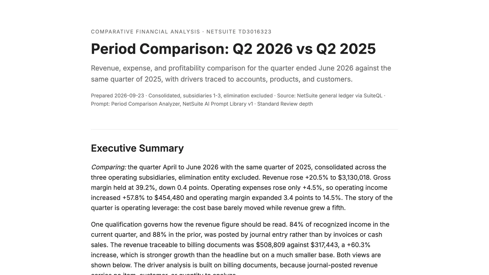
Revenue rose 20.5%. Operating expenses rose 4.5%. So operating income rose 57.8% and operating margin expanded by 3.4 points, and the report calls the quarter what it is: a story of operating leverage, with a cost base that barely moved while revenue grew a fifth.
Then it qualified that. Eighty-four percent of the recognized income in the quarter was posted by journal entry rather than by invoices or cash sales. The report shows both views, the ledger as posted and the revenue traceable to billing documents, and it builds the driver analysis on the second one, because a journal carries no item, customer, or quantity to analyze. On that basis the growth came from two places: a mattress line that sold 23 units per size against 10 the year before, and delivery services that followed the furniture.
It also noticed something across the customer list. The largest lost customer, at $80,079 of prior-year revenue, carries an open receivable of exactly that amount, 460 days past due. The loss and the collection problem are the same account. The largest new customer hasn't paid anything yet either. Both were flagged for review, which is the right answer.
You can read the full report here: Period Comparison: Q2 2026 vs Q2 2025. The names and numbers are test data.