Every growing company has the same hidden tax: operational debt.
Not technical debt. Not financial debt. The kind that accumulates when your team grows faster than your processes. Where the new hire doesn't realize that client onboarding involves 14 manual steps across 4 departments. Where the finance team doesn't find out about new clients until the first invoice is overdue. Where one person's personal spreadsheet is the only thing standing between your project pipeline and chaos.
You know the symptoms:
- No single view of how work flows through your organization
- Nobody can answer "where does this project stand?" without asking 3 people
- Automation attempts that broke after a month and never got fixed
- The feeling that there are obvious improvements hiding in plain sight, but nobody has time to map it all out
Traditional ops consulting solves this. You hire someone for $15K-$50K, they spend weeks interviewing your team, and you get a PDF of process maps that goes stale before the ink dries.
I wanted something different. Something a team lead could run themselves in a single working session, producing an output their whole team could work from.
So I built it.
What the Operations Intelligence Architect Does
It's a single AI prompt that turns into a structured conversation. You talk to it like you'd talk to a senior operations consultant, except it takes 60-90 minutes instead of 6 weeks, and produces a live, interactive HTML dashboard instead of a static PDF.
Here's what the output looks like for a 40-person digital marketing agency:
View the Full Example Dashboard
Meridian Digital — 1,900 lines of interactive HTML
That dashboard is the real output. Not a summary. Not a report. A working document with sortable tables, interactive charts, clickable process maps, and a phased implementation plan, all generated from a single conversation.
Here's what's inside it.
Inside the Dashboard: 7 Sections Your Team Can Work From
The dashboard isn't just a report you read once. Each section is designed to answer a specific operational question and drive specific decisions.
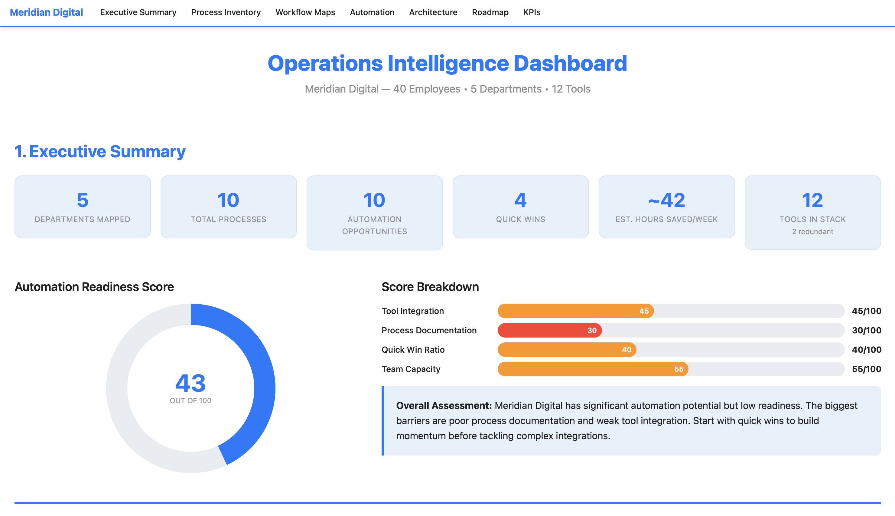
1. Executive Summary
The top of the dashboard gives you the whole picture at a glance:
It includes an Automation Readiness Score, a transparent composite metric (0-100) that tells you how prepared your organization is to automate. Not aspirational. Honest. The Meridian Digital example scored a 43/100, meaning significant potential but poor documentation and weak tool integration. That number alone resets expectations before anyone starts building.
2. Process Inventory
A sortable table of every process you described, ranked by weekly time cost. Color-coded pain levels. Department filter buttons. Click a column header to sort by hours, pain level, or manual step count. This is the "here's where your time is going" view.
3. Department Workflow Maps
This is where the dashboard earns its keep. Each workflow from the conversation is rendered as a visual step-by-step process flow, with every step showing who does it, what tool they use, and how long it takes. Three types of flags are color-coded throughout: manual handoffs (amber), redundancies (red), and automation triggers (green).
In the example, the client onboarding workflow revealed 14 steps, 4 manual handoffs, 2 redundancies, and 5 automation triggers across 4 departments. The lead had said "onboarding is slow." The dashboard showed exactly why it was slow and exactly where to fix it.
4. Automation Opportunities
Every flagged item from every workflow map is compiled, scored, and ranked using a transparent formula:
Priority Score = (Impact × 0.50) + ((10 - Complexity) × 0.30) + ((10 - Build Effort) × 0.20)
This weights actual impact highest, rewards simplicity, and favors faster implementation. Every score is visible and traceable. No black box.
The key visualization is the Impact vs. Complexity scatter chart, where bubble size represents hours saved per week. Your top-left quadrant (high impact, low complexity) shows your quick wins. Your top-right quadrant (high impact, high complexity) shows your big bets.
5. System Architecture
A visual tool connection map showing which systems need to connect, what data flows between them, and where the gaps are. Connections are color-coded: green for existing native integrations, blue for needed API/middleware, red for manual bridges that should be eliminated. In the example, this section also included an integration requirements table with estimated monthly costs, showing that all recommended integrations fit within the team's stated $500/month budget.
6. Implementation Roadmap
A 4-phase timeline:
| Phase | Timeline | Focus | Expected Outcome |
|---|---|---|---|
| Quick Wins | Weeks 1-2 | Highest ROI, lowest effort | ~12 hrs/week saved, $0 cost |
| Core Workflows | Weeks 3-6 | Primary automations | ~33 hrs/week saved (cumulative) |
| Advanced Integration | Weeks 7-12 | Multi-system, complex logic | ~45 hrs/week saved (cumulative) |
| Optimization | Ongoing | Monitor, measure, refine | Sustained improvement |
Each phase includes a task checklist, dependency mapping, and status tracking. The dashboard is designed to be revisited as implementation progresses. Check off completed items, update statuses, track progress against the plan.
7. KPI Dashboard
Before-and-after targets for every measurable improvement, with specific measurement methods. Not "improve efficiency" but "reduce invoice processing from 45 min/invoice to 10 min/invoice, measured by averaging processing time weekly." The department readiness radar chart shows which parts of the organization are most prepared for change and which need more groundwork first.
How It Works: The 5-Phase Conversation
The prompt doesn't just generate a dashboard from thin air. It runs a structured discovery process, the same methodology an operations consultant would use, compressed into a single conversation.
Phase 1: Discovery. You provide your org structure, tool stack, and top 3 bottlenecks. The AI asks 5-8 targeted follow-up questions. Not generic ones like "tell me more," but specific probes: "Walk me through what happens from the moment a deal closes to when the client's first deliverable ships. Who touches it, what tools do they use, and where does it sit waiting?" The output is a Process Inventory Table ranking every process by weekly time cost with pain level scores.
Phase 2: Workflow Mapping. You describe each department's operations in plain English. The AI builds structured process maps, flagging every manual handoff, redundant step, and automation trigger. Each flag includes a specific explanation of why it's flagged and what could replace it. You confirm each map before it moves on. Nothing gets locked in without your approval.
Phase 3: Opportunity Audit. Every flagged item from every workflow map is compiled and scored using the weighted priority formula. You get a ranked top-10 list with detail cards for each opportunity. You can override rankings. In the example, the team lead bumped reporting automation higher because "my AMs are drowning in reports and it's eating their client relationship time." The AI respected that and documented the override.
Phase 4: Architecture & Planning. The AI designs the system architecture: which tools connect where, what integrations are needed, what the data flows look like. It builds a phased implementation roadmap and defines measurable KPIs with baselines, targets, and specific measurement methods. This is where constraints matter. In the example, the team specified a $500/month budget for new tools and locked in HubSpot and Asana as non-negotiable platforms. The architecture respected both constraints.
Phase 5: Dashboard Generation. Everything from the first four phases flows into a single HTML file. All 7 sections. Interactive charts (Chart.js). Sortable tables. Collapsible workflow maps. Sticky navigation. Department filters. Print-friendly. Open it in any browser. No server, no installation, no account needed.
What Makes This Prompt Work
Most AI prompts are instructions. This one is an Expert System, a cognitive architecture designed to maintain analytical rigor over a long conversation, resist common failure modes, and produce consistent output quality whether the user is detailed or vague, cooperative or skeptical.
It Knows What Bad Output Looks Like
The prompt includes six named failure patterns it's trained to avoid:
- The Echo Chamber - restating what you said in fancier language without adding analytical value
- Automation Theater - recommending automation for a 5-minute weekly task that just needs a checklist
- Vanity Dashboard - impressive charts that don't connect to actionable decisions
- Premature Architecture - designing complex integrations before understanding the actual processes
- Complexity Inflation - scoring simple tasks as complex to make the project look bigger
- Orphaned Insights - identifying problems in workflow maps that never appear in the opportunity audit
Most prompts tell the AI what to do. This one also tells it what not to become.
It Pushes Back When It Should
The prompt has built-in anti-sycophancy measures. Instead of agreeing with everything you say, it's designed to probe before it prescribes. If you provide a pre-formed conclusion ("CRM is definitely the bottleneck"), it tests it before confirming: "Before I lock that in, walk me through what happens when [related process]. I want to make sure we're not treating a symptom."
Confidence Drives Action, Not Just Language
The prompt doesn't just label things as "high" or "low" confidence. Confidence level triggers different behaviors:
- HIGH confidence: States the recommendation directly with a solid ROI estimate
- MEDIUM confidence: States the recommendation with caveats and names what data would increase confidence
- LOW confidence: Does NOT recommend action. Instead, flags it as an area to investigate and names specifically who or what would resolve the uncertainty
This means the dashboard never presents a guess as a fact. When numbers are estimates, they're labeled as estimates. When the AI doesn't have enough information, it says what's missing instead of filling the gap with plausible-sounding fiction.
Every Number Is Traceable
The Priority Score formula is embedded in the prompt:
(Impact × 0.50) + ((10 - Complexity) × 0.30) + ((10 - Build Effort) × 0.20)
Every component score is visible in the dashboard. The Automation Readiness Score breaks down into four labeled sub-scores. No black boxes, no "trust me" numbers. This matters because the dashboard is a decision tool. If your team is going to prioritize which automation to build first, they need to understand, and challenge, the scoring.
It Handles Edge Cases Gracefully
The prompt defines explicit behavior for scenarios that would trip up a normal AI interaction:
| Situation | What Happens |
|---|---|
| You give minimal info | Asks targeted follow-ups. If you can't provide more, proceeds with labeled caveats |
| You want to skip a phase | Explains what the dashboard will be missing. If you insist, adds a "Data Gaps" section |
| Very small org (1-5 people) | Scales the framework down: simpler architecture, individual workflow focus |
| Very large org (100+) | Focuses on top 3-5 departments by pain level. Notes more can be mapped later |
| Contradictory information | Flags it directly: "Earlier you said X, now Y. Which is accurate?" |
| You push back on a recommendation | Accepts your judgment but documents the trade-off in the dashboard |
| Implausible estimates | Gently reality-checks: "Is that the active work time, or including wait time?" |
Two Engagement Modes
If you want structure, Guided Mode walks you through each phase with targeted questions, one at a time. If you have all your information ready, Fast Track Mode processes everything at once and presents each phase's output for quick confirmation. The AI detects which mode fits based on your first message.
What's in the HTML File
The dashboard is a self-contained HTML file. No server. No database. No installation. Open it in Chrome, Firefox, Safari. It just works.
Technical Stack
- Bootstrap 5.3+ - responsive layout, accordions, navigation
- Chart.js 4.x - interactive charts with tooltips (scatter, bar, donut, radar, Gantt)
- Vanilla JavaScript - table sorting, department filters, smooth scroll, active nav highlighting
- All CSS embedded - Clarity Blue color palette with CSS variables
- Print-friendly -
@media printstyles included - Accessible - semantic HTML, ARIA labels, proper heading hierarchy, keyboard-navigable
The example dashboard for Meridian Digital is roughly 1,900 lines of HTML with 8 Chart.js visualizations, 4 expandable workflow maps, sortable data tables, and a sticky navigation bar with section links.
You save it as an .html file, share it via email, Dropbox, Google Drive, or Slack, and anyone on your team can open it and start working from it immediately.
The Example: Meridian Digital
To demonstrate the prompt, I ran it against a realistic test scenario: Meridian Digital, a 40-person digital marketing agency with 5 departments and 12 tools in their stack.
Their problems were familiar:
- Client onboarding took 2-3 weeks (14 steps across 4 departments, things constantly fell through cracks)
- Creative feedback came through Asana, Slack, email, AND Loom. Designers working from outdated feedback half the time
- Monthly reporting consumed 48-64 hours/month (4 account managers x 8 clients x 1.5-2 hours each)
- The Traffic Manager's entire resource allocation system was a personal spreadsheet nobody else could use
- Two redundant tools (Asana + Monday.com, Google Docs + Notion)
- A previous Zapier automation attempt that broke after a month and was never fixed
The prompt surfaced all of this, mapped 4 workflows step-by-step, scored 10 automation opportunities with transparent methodology, designed a system architecture within their $500/month budget, and generated the full dashboard.
Key findings from the example:
The biggest insight wasn't a technology recommendation. It was that 30% of creative revision rounds were caused by incomplete briefs, a process discipline problem, not an automation problem. The #1 ranked opportunity wasn't a complex integration. It was a standardized brief template with required fields. Implementation time: 1-2 days. Cost: zero. Impact: 5 hours/week of eliminated rework.
That's the kind of finding that makes this prompt valuable. It doesn't just list "things you could automate." It identifies the root causes, scores them honestly, and sometimes the answer is "you don't need automation, you need a template."
Who This Is For
This prompt is designed for internal team leads, the person who knows something is broken but doesn't have time to do a formal process audit. Specifically:
- Operations managers who need to justify where to invest in process improvement
- Department heads who want to map how work flows (vs. how they think it flows)
- Growing companies (15-100 people) where processes haven't kept up with headcount
- Consultants and fractional ops leaders who want to deliver rapid diagnostic value to new clients
- Anyone preparing a business case for workflow automation investment
It works with any industry. The example uses a marketing agency, but the same prompt has generated dashboards for e-commerce operations, professional services firms, and SaaS companies. The methodology is industry-agnostic. The prompt adapts its questions to whatever you describe.
How to Use It
Step 1: Purchase the prompt on Gumroad ($99).
The package includes the full prompt, a lite version (35% of the full version's length, for smaller context windows), the example dashboard, a quick-start card, and a full user guide.
Step 2: Paste it into your AI tool's system prompt. Claude, ChatGPT, Gemini. They all work.
Step 3: Start talking. When the prompt asks for your org structure, tools, and bottlenecks, provide them. Answer the follow-up questions honestly. Be specific about time: "4 hours/week" beats "too long."
Step 4: Confirm each phase. Review and correct each phase's output before moving to the next.
Step 5: Save and share. Save the generated HTML file and open it in your browser. Share it via email, Dropbox, Google Drive, or Slack. Anyone on your team can open it and start working from it immediately.
Time investment: 60-90 minutes for a thorough mapping. Faster if you use Fast Track Mode with prepared information.
Pro tip: Don't forget the informal tools. Shared Google Sheets, email-based approval chains, Slack threads that function as to-do lists. Those are often where the real bottlenecks hide. The prompt is designed to probe for these, but the more you surface upfront, the richer the dashboard.
Model Compatibility
| Model | Compatibility | Notes |
|---|---|---|
| Claude (Sonnet / Opus) | Excellent | Full feature support. Recommended for best dashboard output |
| GPT-4 / GPT-4o | Excellent | Full support, handles multi-turn conversation well |
| Claude Haiku | Good | May need the lite version for complex organizations |
| GPT-3.5 | Moderate | Use lite version; dashboard quality will be reduced |
Try This First
When you load the prompt, start with something like this:
We're a 30-person professional services firm. Our biggest bottleneck is project handoffs between sales and delivery. We use HubSpot for CRM, Asana for project management, and QuickBooks for invoicing. Nothing talks to each other.
The AI will respond with 5-8 targeted follow-up questions, not generic ones, but probes designed to uncover how work moves between people, where things stall, and what informal tools your team relies on. That first exchange is where you'll know this is different from a standard AI conversation.
From there, you'll move through the five phases at your own pace. Confirm each output before the prompt moves on. The whole process takes 60-90 minutes for a thorough mapping.
What I Learned Building This
I used to think the value of an operations audit was the recommendations. It's not. It's the process of forcing someone to describe how work flows out loud. Most teams have never done that. The bottlenecks aren't hidden. They're just never articulated. This prompt replicates that forcing function.
A few other things surprised me during development.
The hardest part isn't the dashboard. It's the discovery. Getting an AI to produce good HTML is relatively straightforward. Getting it to ask the right follow-up questions, the ones that uncover hidden handoffs and tribal knowledge, required the most engineering. The question priority framework (8 question types ranked by what they uncover) was the single most impactful addition to the prompt.
Anti-sycophancy matters more than you'd think. Without explicit "you are NOT" instructions and named failure patterns, the AI tends to agree with whatever the user says, inflate ROI estimates, and recommend automation for everything. The negative persona priming and output inoculation were necessary to maintain analytical integrity over a 60-90 minute conversation.
Transparent scoring changes the conversation. When the formula is visible and every component score is shown in the dashboard, teams engage with the rankings instead of just accepting them. "Why did this score a 3 on complexity? I think it's harder than that." That's the right conversation to be having.
Quick wins matter more than big bets. In every test run, the most valuable recommendations were process discipline improvements (templates, policies, channel consolidation) that cost nothing and could be implemented in days. The prompt is designed to surface these and rank them honestly, even when they're less exciting than a complex multi-system integration.
About the Prompt
The finished prompt is roughly 450 lines and 4,200 words, organized into 25+ named sections. It includes an Expert System architecture with 5 layers, a transparent scoring methodology, a 7-section dashboard specification, 11 edge case handlers, 15 constraints, 6 behavioral examples, 14 verification steps, named failure patterns, and confidence-to-action pathways.
It went through 2 optimization cycles with automated evaluation, linting for 8 anti-patterns, and adversarial failure mode testing (7 scenarios, all passed). The Expert System elevation applied 5 architectural layers on top of the core workflow.
The original idea was a progressive 6-step workflow from discovery to dashboard. What the optimization added was the structural rigor needed for reliable execution: the difference between "this works when I demo it" and "this works when anyone uses it."
Limitations
A few things this prompt is not:
- It's only as good as the information you provide. The prompt probes hard, but it can't observe your team working. If you don't surface the informal tools, the workarounds, and the "we've always done it this way" processes, they won't appear in the dashboard.
- It doesn't implement anything. The dashboard is a diagnostic and planning tool, not an execution engine. You still need people to build the automations, configure the integrations, and change the processes.
- Complex or regulated environments may still need a human consultant. If you're operating under SOX controls, managing HIPAA-sensitive workflows, or running a multi-site manufacturing operation with hundreds of process variants, this prompt gives you a strong starting point, but it doesn't replace domain-specific expertise.
- Dashboard quality depends on the AI model. Smaller models produce simpler dashboards. For the full experience, use Claude Sonnet/Opus or GPT-4.
- It's a point-in-time snapshot. Your operations will evolve. The dashboard captures how things work today. Plan to re-run the process quarterly, or whenever a significant process change occurs.
Bottom line: treat this as a very capable diagnostic tool that gets you 80% of the way to what a senior operations consultant would deliver, in 90 minutes instead of 6 weeks. The last 20%, the hands-on observation, the organizational politics, the implementation support, still requires a human.
The Bottom Line
One prompt. Five phases. A dashboard your whole team can work from.
The Operations Intelligence Architect turns a conversation about how your team works into a structured, interactive, actionable operational command center. No consulting engagement required.