In Beta 2 of the NetSuite SuiteQL Query Tool v2021.2, I added support for generating PDF and HTML documents. This opens up a world of possible additional uses for the tool, including using it to generate ad hoc reports.
By using the tool's HTML document generation option, along with a Javascript-based charting library, you can also use the tool to generate charts that are based on the results of your queries. Here's a short animation that shows an example of this technique.
To use this technique, you will need to do a little coding. However, if you're already comfortable with Javascript and FreeMarker, then I think you'll find the technique to be easy to use.
In this post, I'll walk through a couple of examples of the technique. I'll be using Chart.js, an open source JavaScript library, to generate HTML5 charts based on query results.
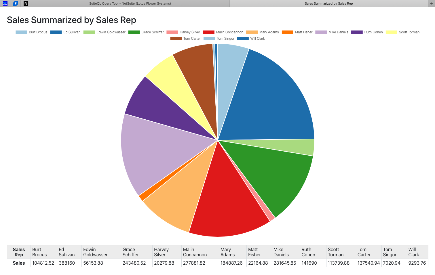
Sales Summarized by Sales Rep
For the first example, I'll generate a pie chart based on sales by sales rep. This example uses a very simple query, with minimal filtering on the transactions. Keep in mind that I'm using a test drive account, so the data is (1) fake and (2) sparse.
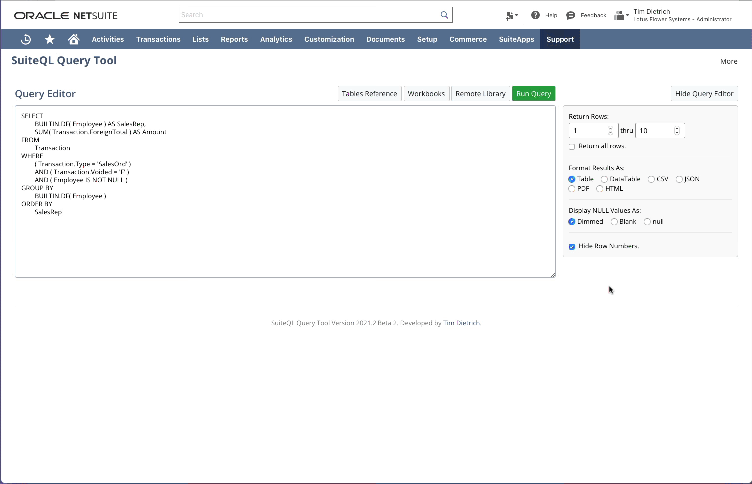
Here's the query.
SELECT
	BUILTIN.DF( Employee ) AS SalesRep,
	SUM( Transaction.ForeignTotal ) AS Amount
FROM
	Transaction
WHERE
	( Transaction.Type = 'SalesOrd' )
	AND ( Transaction.Voided = 'F' )
	AND ( Employee IS NOT NULL )
GROUP BY
	BUILTIN.DF( Employee )
ORDER BY
	SalesRep
Here's a screen shot showing the results of the query after it has been run in the SuiteQL Query Tool.

Next, I'll select "HTML" as the results format, and then I'll hide the Query Editor to free up some space in the window. Then I'll paste in the template to be used to generate the document. Here's a screen shot showing what the SuiteQL Query Tool looks like at this point.
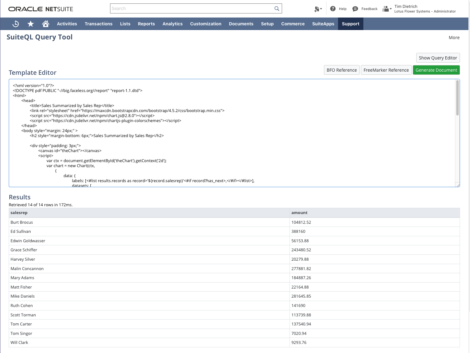
Here's the template that I had pasted in.
<?xml version="1.0"?>
<!DOCTYPE pdf PUBLIC "-//big.faceless.org//report" "report-1.1.dtd">
<html>
	<head>
		<title>Sales Summarized by Sales Rep</title>
		<link rel="stylesheet" href="https://maxcdn.bootstrapcdn.com/bootstrap/4.5.2/css/bootstrap.min.css">
		<script src="https://cdn.jsdelivr.net/npm/chart.js@2.8.0"></script>
		<script src="https://cdn.jsdelivr.net/npm/chartjs-plugin-colorschemes"></script>
	</head>
	<body style="margin: 24px;" >
		<h2 style="margin-bottom: 6px;">Sales Summarized by Sales Rep</h2>

		<div style="padding: 3px;">
			<canvas id="theChart"></canvas>
			<script>
				var ctx = document.getElementById('theChart').getContext('2d');
				var chart = new Chart(ctx,
					{
						data: {
							labels: [<#list results.records as record>'${record.salesrep}'<#if record?has_next>,</#if></#list>],
							datasets: [
								{
									label: 'Sales',
									data: [<#list results.records as record>${record.amount}<#if record?has_next>,</#if></#list>]
								}
							]
						} ,
						type: 'pie',
						options: {
							responsive: true,
							plugins: {
								legend: { position: 'top' },
								title: { display: true, text: 'Sales Summarized by Sales Rep' }
							}
						}
					}
				);
			</script>
		</div>

		<div style="margin-top: 24px;">
			<table width="100%" class="table table-sm table-bordered table-hover table-responsive-sm">
				<tr>
					<th>Sales Rep</th>
					<#list results.records as record>
						<td>${record.salesrep}</td>
					</#list>
				</tr>
				<tr>
					<th>Sales</th>
					<#list results.records as record>
						<td>${record.amount}</td>
					</#list>
				</tr>
			</table>
		</div>

	</body>
</html>
Before continuing, here are a couple of quick notes about the template.
First, notice that I've included references to the Chart.js library, as well as a utility for generating the colors that are used on the charts. Both files are being included via jsDelivr, a free CDN for open source software.
Also notice that I'm using some basic FreeMarker code to generate the labels and data that are needed for the chart. I'm using similar code to generate the HTML table that appears below the chart.
To generate the document, I simply click the "Generate Document" button. Here's a screen shot showing the document.
By making a very minor change to the template, you can easily generate a "Doughnut" chart type. In the template, change the chart type from "pie" to "doughnut." The result will look something like this.

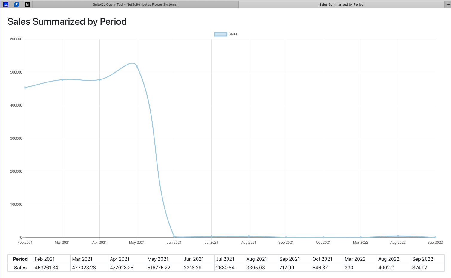
Sales Summarized by Period
Here's another example of the charting technique. In this example, I'll generate a chart showing sales summarized by period.
The query looks like this.
SELECT
	AccountingPeriod.PeriodName,
	AccountingPeriod.StartDate,
	SUM( Transaction.ForeignTotal ) AS Amount
FROM
	Transaction
	INNER JOIN AccountingPeriod ON
		( AccountingPeriod.ID = Transaction.PostingPeriod )
WHERE
	( Transaction.Type = 'SalesOrd' )
	AND ( Transaction.Voided = 'F' )
	AND ( Transaction.PostingPeriod IS NOT NULL )
GROUP BY
	AccountingPeriod.PeriodName,
	AccountingPeriod.StartDate
ORDER BY
	AccountingPeriod.StartDate
Again, I'm using a very simple query, with minimal filtering on the transactions. You'll probabaly want to filter the transactions based on a date range. However, because I'm using a test drive account and don't have a lot of data to work with, I'm including all sales orders in the account.
To generate a line chart based on the query results, I'm using this template.
<?xml version="1.0"?>
<!DOCTYPE pdf PUBLIC "-//big.faceless.org//report" "report-1.1.dtd">
<html>
	<head>
		<title>Sales Summarized by Period</title>
		<link rel="stylesheet" href="https://maxcdn.bootstrapcdn.com/bootstrap/4.5.2/css/bootstrap.min.css">
		<script src="https://cdn.jsdelivr.net/npm/chart.js@2.8.0"></script>
		<script src="https://cdn.jsdelivr.net/npm/chartjs-plugin-colorschemes"></script>
	</head>
	<body style="margin: 24px;" >
		<h2 style="margin-bottom: 6px;">Sales Summarized by Period</h2>

		<div style="padding: 3px;">
			<canvas id="theChart"></canvas>
			<script>
				var ctx = document.getElementById('theChart').getContext('2d');
			var chart = new Chart(ctx,
				{
					type: 'line',
					data: {
						labels: [<#list results.records as record>'${record.periodname}'<#if record?has_next>,</#if></#list>],
						datasets: [
							{
								label: 'Sales',
								data: [<#list results.records as record>${record.amount}<#if record?has_next>,</#if></#list>],
								fill: false
							}
						]
					}
				}
			);
			</script>
		</div>

		<div style="margin-top: 24px;">
			<table width="100%" class="table table-sm table-bordered table-hover table-responsive-sm">
				<tr>
					<th>Period</th>
					<#list results.records as record>
						<td>${record.periodname}</td>
					</#list>
				</tr>
				<tr>
					<th>Sales</th>
					<#list results.records as record>
						<td>${record.amount}</td>
					</#list>
				</tr>
			</table>
		</div>

	</body>
</html>
Notice that the template is very similar to the one used above, especially the code used to generate the labels and data for the chart, and the table that appears below the chart.
Here's a screen shot showing the document that is generated for this example.
Wrapping Up
In this post I've shown you a few examples of a technique that you can use to generate pie, doughnut, and line charts via the SuiteQL Query Tool. Chart.js also provides support for generating a number of additional chart types, including bubble charts, scatter charts, radar charts, and more. It's a very impressive library, with a great community of developers that are supporting and enhancing it. I encourage you to learn more about Chart.js, and to explore the possibilities that it presents.
In terms of the SuiteQL Query Tool Version 2021.2, Beta 2 is still in testing, and I'm continuing to get helpful feedback on it from the community. So far, everything seems to be working as expected, and the latest version is stable. I still have a few changes that I'd like to make to it, and I also need to work up the documentation for this release. In any case, I plan to officially release the 2021.2 version very soon.
If you have any comments, questions, or suggestions about this post or the SuiteQL Query Tool, please post them to the SuiteQL channel over on the NetSuite Professionals Slack Community. If you'd like to contact me directly, click here.